Trends are shifting away from white toward warmer neutrals. This means saying goodbye to all those white walls and opting for more complex, warm hues combined with richer colours. And, I can help you stay ahead of the curve.
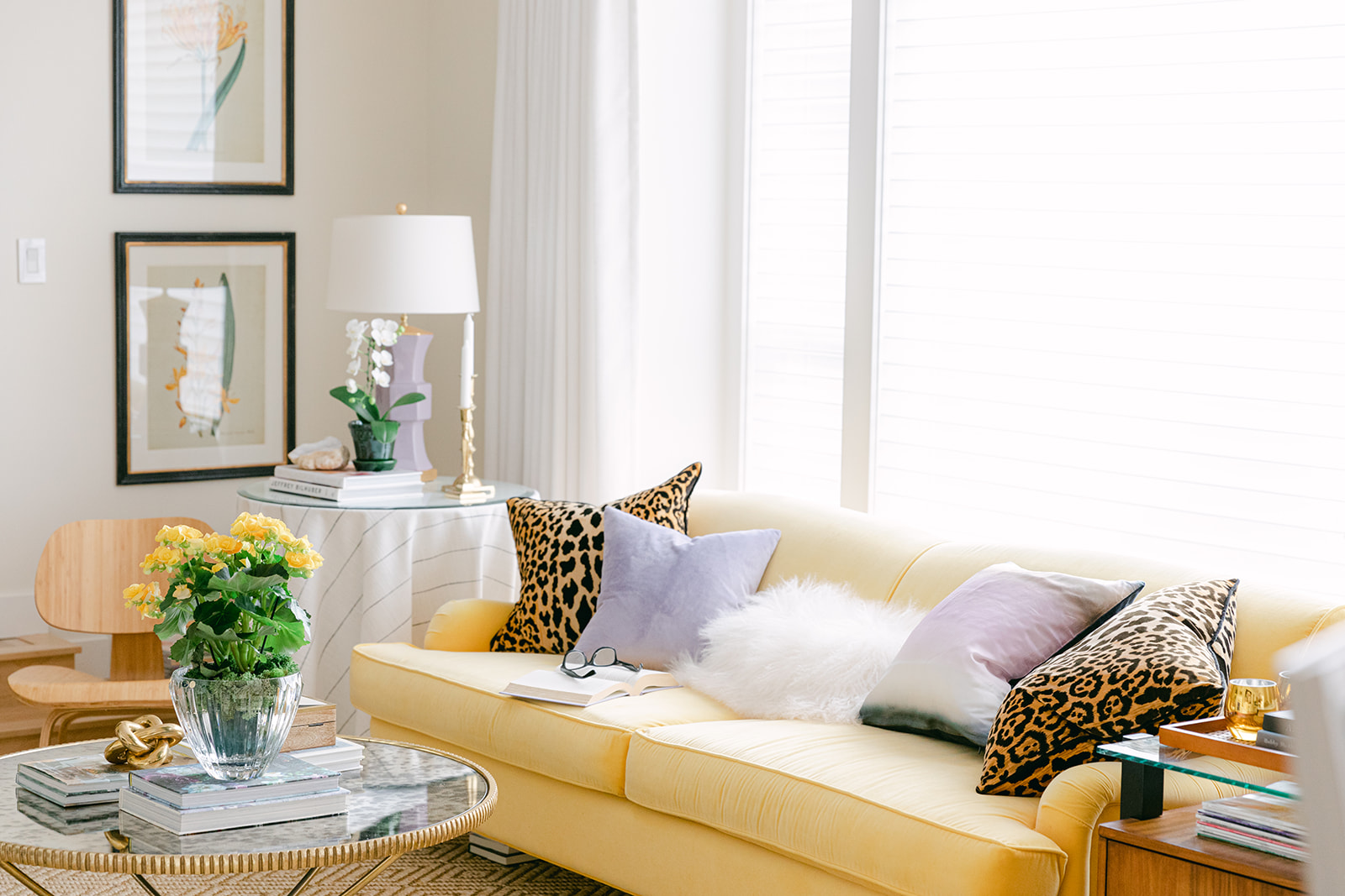
Sneak peek of my brand new living room makeover, full makeover reveal coming very soon!
Colour trend cycles
There are phases in the trend cycle where we get comfortable. Things are predictable and stable.
And then there are phases where things start to shift more dramatically. I’ve always said a major trend has a life span of about 10 years. Once we get to the last couple of years in that span, well, creators and consumers alike are restless. That’s when we start to see reactionary shifts to the status quo.
And, it’s happening right now in the world of colour.
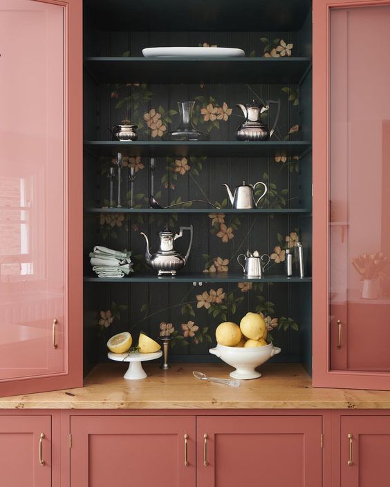
Increasingly we are seeing cabinets painted in rich colours, like in this image above. If this was a client’s kitchen or a cabinet colour on your design wishlist, would you know how to create colour flow with decorating to make this look work with the rest of the house?
That’s just the tip of the iceberg.
But first, everything you need to know about white
As an educator and True Colour Expert, I interact with hundreds of designers at all phases of their careers. But recently, I have met many designers who have never worked outside the white walls trend, as well as more seasoned ones that have become a bit too comfortable with a clutch of good whites. Sound familiar?
At the peak of the white walls trend a couple of years ago, I was starting to wonder if people even cared to learn about the undertones of neutrals. So I developed tonnes of new content in my Specify Colour with Confidence Courses to help them navigate the complicated world of whites.
And that’s a pretty big deal! Because now my course offers even more in-depth and practical approaches to specifying whites that you won’t find anywhere else in the world!
Trends are shifting back to colour
But like I said, RIGHT NOW we are witnessing the biggest shift in colour trends we’ve seen in a decade.
Here’s what’s happening: NEUTRALS, especially BEIGE, are BACK.
Are you colour confident?
You’re here, so I already know that you care about getting colour right. So tell me…
Are you ready to help your clients choose the correct undertone of complex cream, warm greige or beige for their project?
Do you feel confident about choosing neutrals for your home – and not just wall colour, but coordinating finishes like floors, countertops or tile?
Even if you WERE able to finesse beiges 15 or 20 years ago, do you know what’s new in the world of specifying warm neutrals? And, are you familiar with how beige is being used in design now?
Because no trend ever circles back exactly the same as it was.
Help me choose a dark white…
I’m telling you that your client’s colour requests are about to become MUCH more complicated than, “paint it all white!”
For example, how do you interpret their request for a “warm neutral”, a “dark white”, or an “earthier charcoal”?
These are the kinds of requests we are seeing daily in my eDesign department.
You can’t ignore colour trends
Although timeless rooms are not bound by trends, you need to know what’s trending
It’s not like I can’t show you plenty of perfectly timeless rooms with white walls. Or beige, grey, brown or purple walls for that matter. It’s just that collectively [yawn] we’ve been there, done that. It’s human nature. Once a specific look becomes ubiquitous, we crave something new.
And right now, that’s a turn towards wood and beige in a wide range of decorating styles from minimalism and mid-century modern to plush traditional spaces influenced by homey Arts and Crafts and British revival. They are ALL looking warmer.
Beige is suddenly sexy.
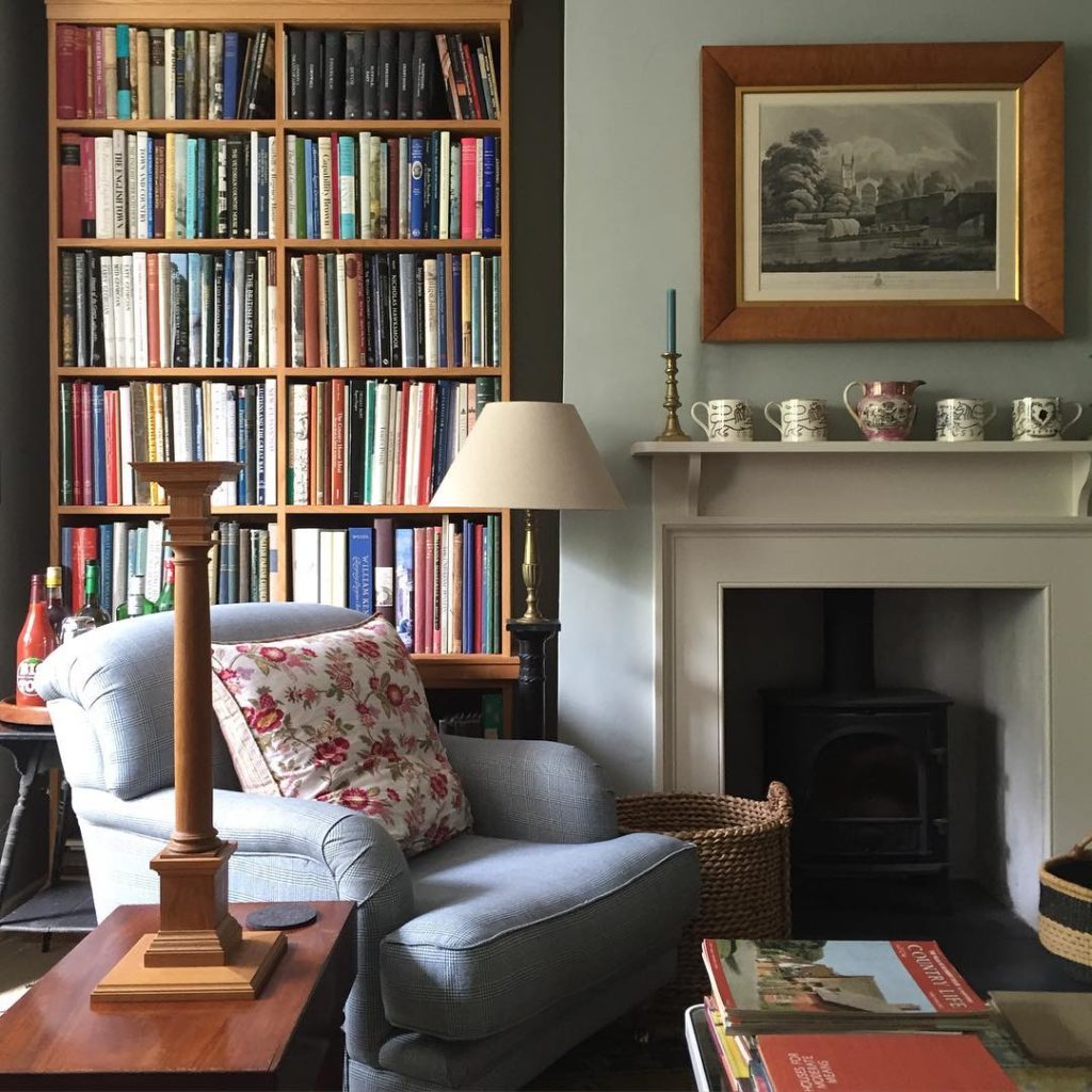
A pretty example of British Revival by @geosaumarezsmith
So, if you’ve thought about taking my course, but haven’t had the pressure to master colour as you specify the same white for all your lovely clients?
The time to master colour is now
Believe me, I’ve been where you are. The pressure is really scary whether you’re designing a home for a client or for yourself.
And if you want to have all the colour savvy necessary to pull off a beautiful and timeless renovation or new build, you can’t afford to wait.
There are so many things to handle at once, but the trickiest part will be selecting the perfect, timeless colour scheme. You’re going to second-guess every choice you’ll make without the right guidance
Because on top of…
- learning how to discern and work with the super subtle undertones of neutrals
- the best-applied advice for working with whites in the business
- and, how to create flawless harmonious colour palettes at any level of saturation
You’ll also learn what it takes to create timeless spaces regardless of the trend cycle.
And knowing how to work with the trends in a timeless way is THE CORE SKILL, my friends.
Sharpen your colour skills
Courses fill up fast! My fully immersive and interactive Specify Colour with Confidence courses are now conveniently online! Meaning you can complete them from the comfort of your own home or office. But don’t worry, I can still bring you all the energy through your computer screen!
How to become a True Colour Expert
Make 2022 the year you start to become a True Colour Expert. Spend two immersive days with me and join my exclusive TCE Facebook page for ongoing peer support after the workshop ends.
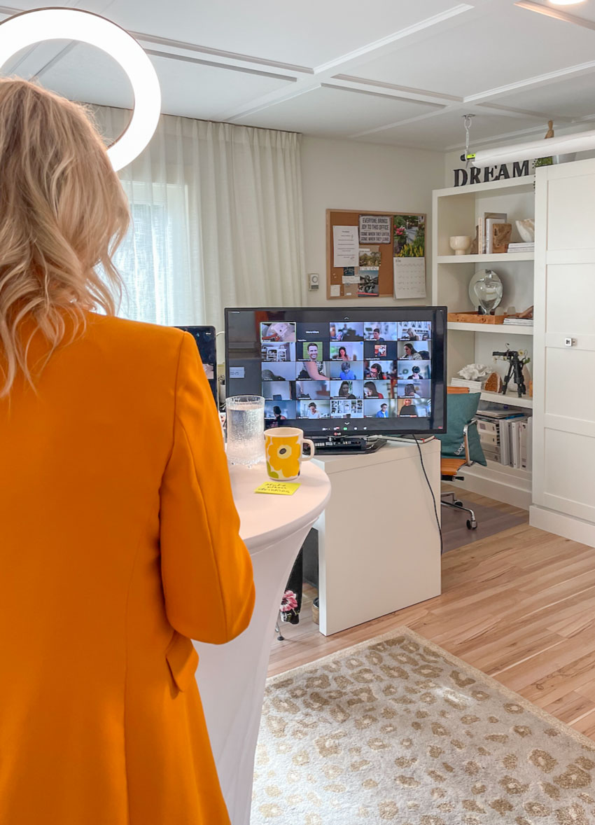
Martha Stewart Beige Leopard Rug
Get the kind of colour confidence that puts you way ahead of the curve.
The beauty of my System for Specifying Colour is that it teaches you how to distinguish colours correctly, putting you light years ahead of everyone who still relies on colour theory.
This training will help you gain the confidence to make swift, but accurate colour decisions, whether you’re already an expert designer, a homeowner with no clue where to begin, or even in a custom home construction business looking for a guide.
Consider this workshop as an investment rather than an expense. Because, if I can save you from one mistake, this workshop is worth thousands of dollars.
We’ve received so many amazing testimonials from people who loved the virtual training and declared it just as much of a game changer as an in person event:
I’m very grateful to have done this course & for all that I learnt from Maria over the two days. The course was well put together, hugely inspiring, but above all PRACTICAL. The step by step process of Maria’s approach to an interior colour scheme & the application of her colour system is an invaluable foundation for any colour & decorating enthusiast or designer. Plus her tips on working with clients are SO helpful.
Maria Killam is a fantastic teacher. She has a wealth of experience & is funny, frank, accessible & engaging. Flying over to North America to do one of the Specify Colour with Confidence workshops, in the 6 or so years I’ve been following the Colour Me Happy blog, just hasn’t been a viable option so I am thrilled to have finally had the opportunity to do the course virtually. Thank you🙏🏡💞
Anyway thank you once again & warmest regards, Lizzie Bodenham, Australia
Click this link to save your seat now – BEFORE the price goes up. The early bird price ends Monday, January 31 at midnight!
Related posts:
What You Should Know About Beige in 2022
Another Creative Who Traded in Their Old Job for a Design Career


“Beige is suddenly sexy”
Ha ha. That was unexpected!
Maria how does a color become “sexy”. I have never thought of color and sex being joined. Just don’t understand what you are trying to say by relating color to sex.
Sexy can be used to mean “ exciting” .
I’m still a white person. My kitchen cabinets were beige for about 20 years and I had to change it! I went to SWAlabaster plus all the walls in my living room, dining, room and hallway are the same. I have white sofas but I coordinate my island and counter top in a medium brown. Then it is so easy to bring in color any time I want to. My dining room has white chairs with a brown table. The funds just are not there to change up when a new trend comes along. But I still enjoy seeing how rooms are designed and with what colors. Maria’s posts are very educational and all the photos are excellent.
Maria,
Great post as always. I have always preferred complex creams to white so this makes me happy. Where do u see hardware going?
With the complex creams and beiges I assume we will see less clean colors and move into more dirty colors to compliment ?
Rae
I don’t like cream, so I lean to greige. I just redid my kitchen in wood cabinets with a light greige granite. I knew the trends were headed warmer, but I can only go so warm personally. I think that greiges are perfect for people like me, and that’s why the warm grays will still work. I’m really glad to see more color coming back into decor!
Yes. Love the diversity that’s happening in design! Maria could you please expand on this : Traditional spaces influenced by homey Arts and Crafts and British revival. I am recently gravitating to traditional design, which is perfect for my colonial house, but it can easily get too busy.
I’m so glad I bought your ebook about whites when I was building in 2019. Everyone suggested I paint my walls a gray-white. There was a very popular paint color that everyone was using. But instead I picked a warmer white from your book. It’s not that I’m pleased to be on-trend now, two years later. Trends come and go. I’m happy because I like it very much, and I’m happy living somewhere that I’m making my own.
I am lovong the return to warm neutrals, and fortunately took your advice and installed a slightly creamy off white kitchen and tile when I knew I would have dark timber worktops ( Australian Jarrah, it works in my place), but can you please address how everyone who has installed marble and caesarstone with grey undertoning and veining can make this work with the beige/cream trend? Love your work!
Just when I was thinking about painting over all my revere pewter with white. I seem to be constantly at the end of trends. But still I’m not sure I’m ready to go back to beige.
I’m taking your course later this month. Looking forward to learning more.
My house calls for beige, warm whites and complex creams. It’s very Tuscan trend.
My problem is that I have made a few mistakes along the way before finding you. Working with what I have.
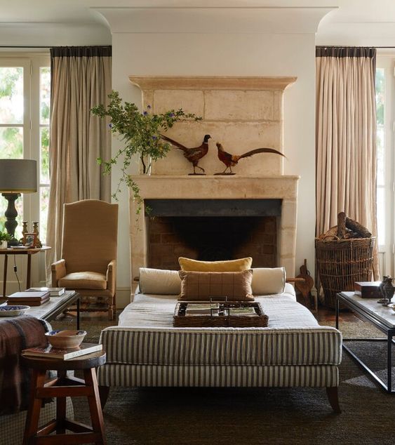
I love the example you shown above in the livingroom with the fireplace. I am looking to paint/limewash my fireplace. I have a golden knotty pine walls and I belive my carpet is a pink beige (waiting on my color wheel to arrive to verify). The color is called Autumn Wheat.. Furnishings are ivory.
What color do you think the fireplace is in the example above? It seems to work in this room with the Travertine fire box and the pink beige curtains. Can mixing pink beige and orange beige be done successfully? I hope so.
I am infatuated with your gray and taupe leopard rug. I think I need it for a project room/spa conbination with furnishings in white and blonde/natural wood, soft gray-with-aqua undertone wall, and silvery/platinum accents to bring in that Tropical/BC flair I love. Can you reveal where you got it?