Too often I hear clients complain about their paint colour and blame the lighting as a result. They believe that since the colour looked fine on the paint chip, the lighting must be what’s wrong. But this is rarely the case. Good News! The top 5 reasons your paint colour looks wrong is easier to fix than the lighting.
I’ve been specifying paint colours for 20 years. In my experience, the number one reason why a client becomes critical of a paint colour is when it doesn’t relate to anything.
That’s when they start to assume that light may in fact be the culprit.
Designers are notorious for blaming the light. I guess if you don’t understand undertones, you have to blame it on SOMETHING.
If I had a dollar for every time a designer has confided: “Maria, the light turned the colour pink, or green, or purple (for example), and then after they show me the colour well, in actual fact, it is pink, or green or purple.
There are also countless articles on the web that support this theory.
‘My Robin’s egg blue looks like a cheap hotel room’ screamed one article.
Well I don’t need to read any further to inform you that the blue they chose was obviously too clean (for their taste). Yet the author went on to talk about all the different coloured light bulbs out there, in addition to all the many ways sunlight affects paint colour.
And by the way, there’s nothing wrong with a bright ‘Robins egg blue’ if it relates to what’s happening in the room.
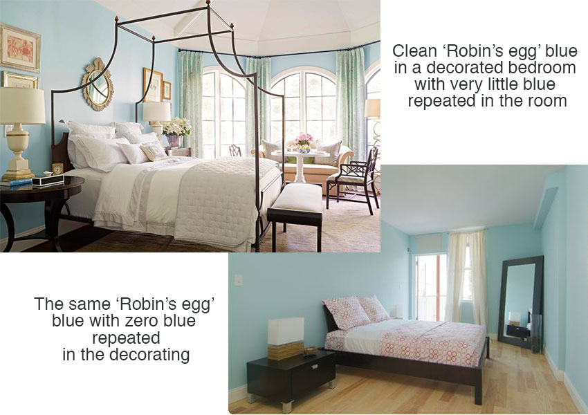
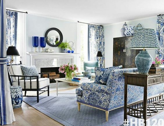
For example, the blue in the first photo below looks lovely because the room is decorated. EVEN though the blue paint colour appears only in the drapery.
The same blue in the room on the right (below) it could be interpreted as a ‘cheap hotel room’ blue by some.
Does this have anything to do with the light?
Nope.
It simply looks like we’ve moved in and haven’t painted the walls yet.
However, if you don’t understand how to choose paint colours, you might look at the same room and be convinced that the light turned the lovely blue on your paint chip into a bright *screaming* blue that’s WRONG.
I am not saying that lighting is NEVER a factor. Not at all.
But more often than not, there is a much higher possibility that one of the following things is happening. And thankfully, these reasons are much easier to control and correct.
5 Reasons Your Paint Colour Looks Wrong
These are the 5 most common reasons your paint colour is not working (and they have nothing to do with the lighting):
- You chose the wrong undertone.
- The colour doesn’t relate to anything else in the room.
- You chose a colour that was too clean (bright) or too dirty (muted, dull, or toned down).
- The colour is simply too dark (and you might not even realize that’s WHY it’s bothering you).
- The room is missing a look and a feel.
Okay let’s deal with the first one because it’s the most common problem. It’s the wrong undertone.
1. YOU CHOSE THE WRONG UNDERTONE
Here’s the first email I received from a reader:
We have built a brand new cottage, the colour I chose for the cabinets was BM Rocky Road. The kitchen manufacturer did not provide us with a sample of the cabinets prior to spraying them. I feel that the pantry, in the light, shows up with a pink undertone.
The kitchen guy wants us to see the cabinets in all the lighting throughout the season “Because it’s going to make a difference” – grrrrr.
I would have seen this colour change with a sample but we were not given that opportunity. What do we do now?
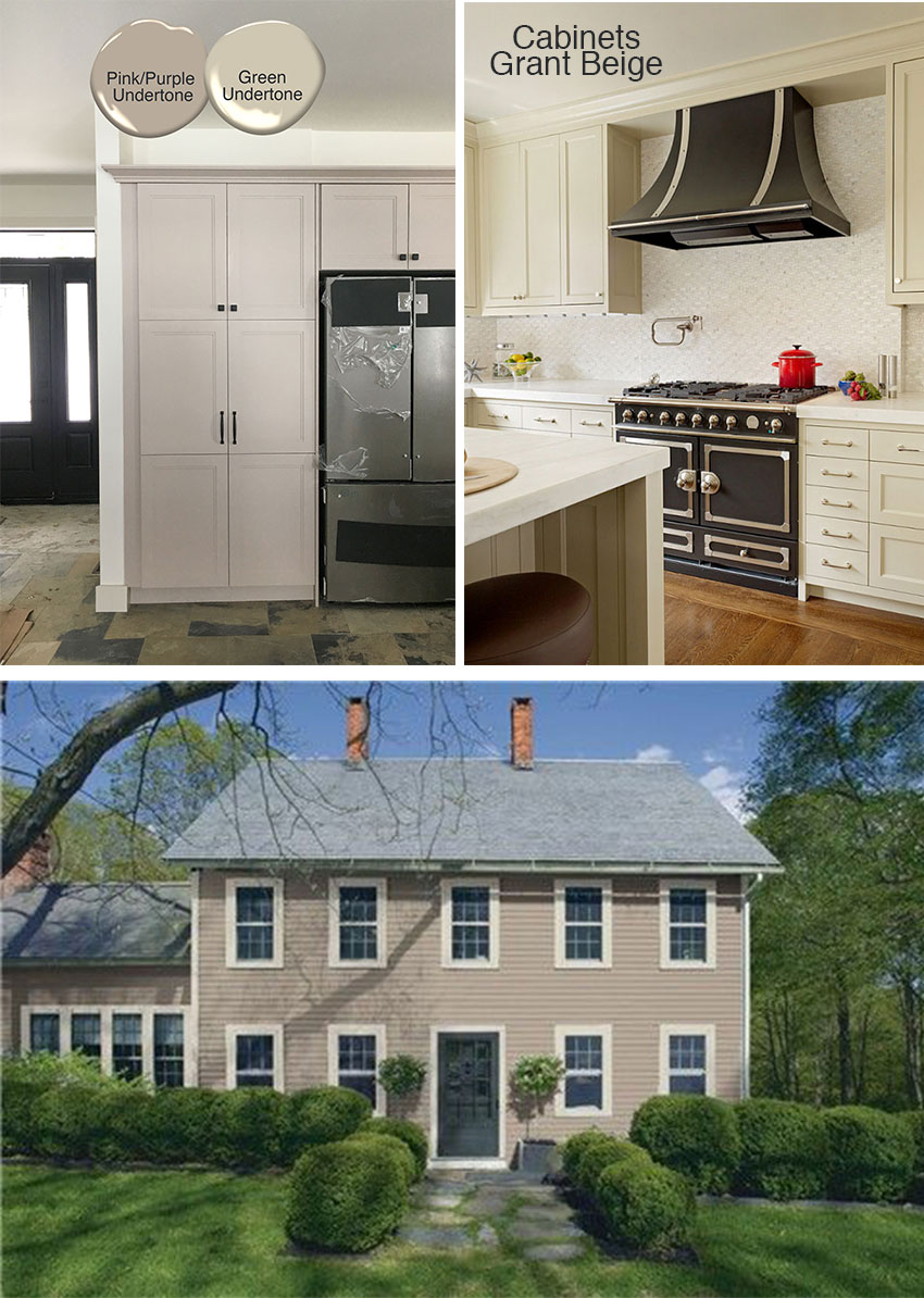
Exterior (Rocky Road) | Cabinets (Grant Beige)
Unfortunately I don’t have good news for this dilemma. The cabinets will never look right until they are repainted. And as you can see by the exterior above, and the comparison of the two paint chips in the photos, Rocky Road is in actual fact a quite obvious pink taupe.
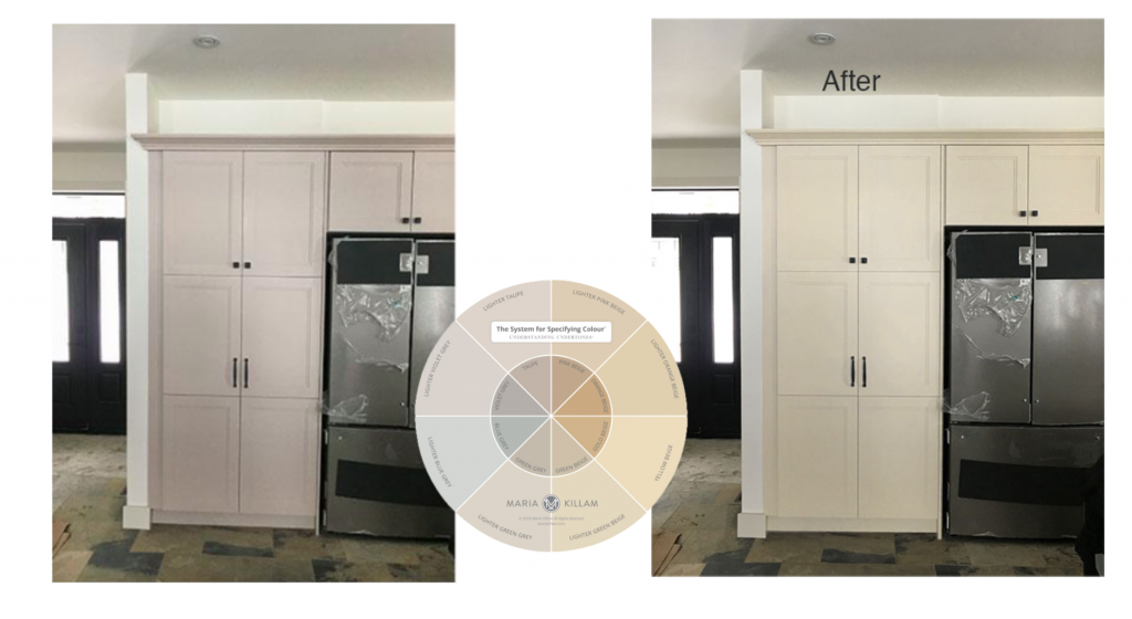
I had the cabinets photoshopped so they are closer to Grant Beige which is a green beige. Much better with the slate flooring.
Never and I mean NEVER, approve a cabinet colour without getting a painted sample from your cabinet manufacturer. Even if you have to pay $100 for them to produce a sample, do it.
It’s much cheaper than painting the entire kitchen AGAIN.
2. THE COLOUR DOESN’T RELATE
Okay so here is the next question:
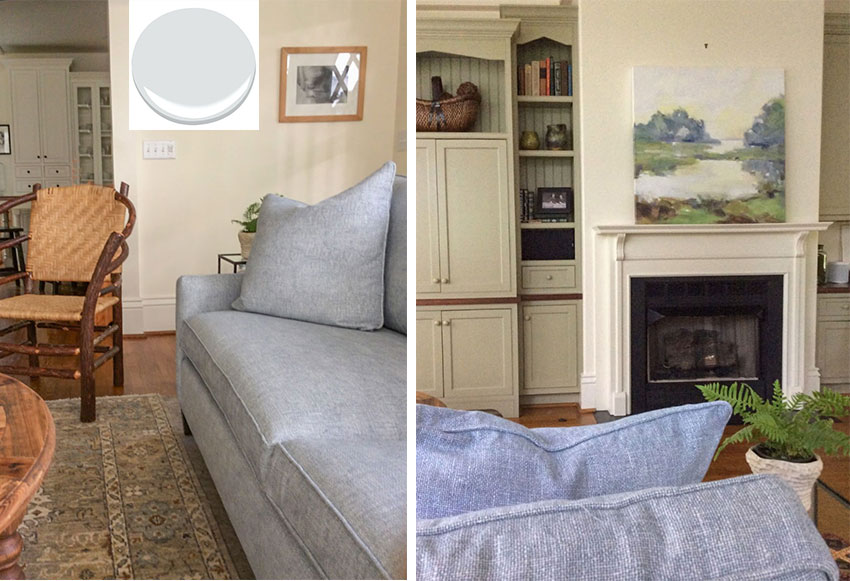
My kitchen cabinets and walls are Ben Moore Ivory White, so they cannot change. I’ve got a cream and off white thing going on in the kitchen.
I purchased the artwork first, for color inspiration and then chose the sofa fabric based on the blue gray color in the painting. I had a very large swatch and moved it around for days before ordering the sofa.
The rug is just there as a placeholder and belongs in another room. Ignore the sage cabinets as they are going to be painted soon. And I know to take off the pillows that came with the sofa but it’s what I have for the moment.
Did I make a huge mistake?
No, you didn’t make a mistake. There’s nothing wrong with your ivory walls, however you don’t have any cream in your decorating at the moment.
Read more: This is the biggest paint colour mistake (and you keep making it)
You need to repeat the cream in your pillows, and your area rug and when you do that, it’ll look right again.
If your sage green rug and cabinets were staying it would look a little more like you hadn’t painted your walls yet and in this case I would consider painting the walls blue.
You can see that this room (above) looks great with blue walls but the walls could also be off-white given there’s lots of white repeated in the decorating.
Okay reason number 3 you hate your paint colour:
3. YOU CHOSE A COLOUR THAT WAS TOO CLEAN (too bright) or TOO DIRTY (muted, dull or toned down)
If you colour is too clean or too dirty, this means it still doesn’t relate to the furnishings or the hard finishes.
Here’s the next question:
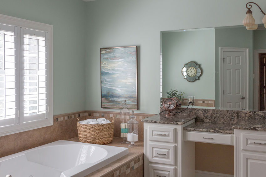
Here are some pictures of my clean/dirty master bathroom. When we moved into this house a few months ago, the whole house was painted beige, beige, beige with lots of pink beige tile.
We hired one of your True Color Experts for a paint consult to help us get started with new paint colors.
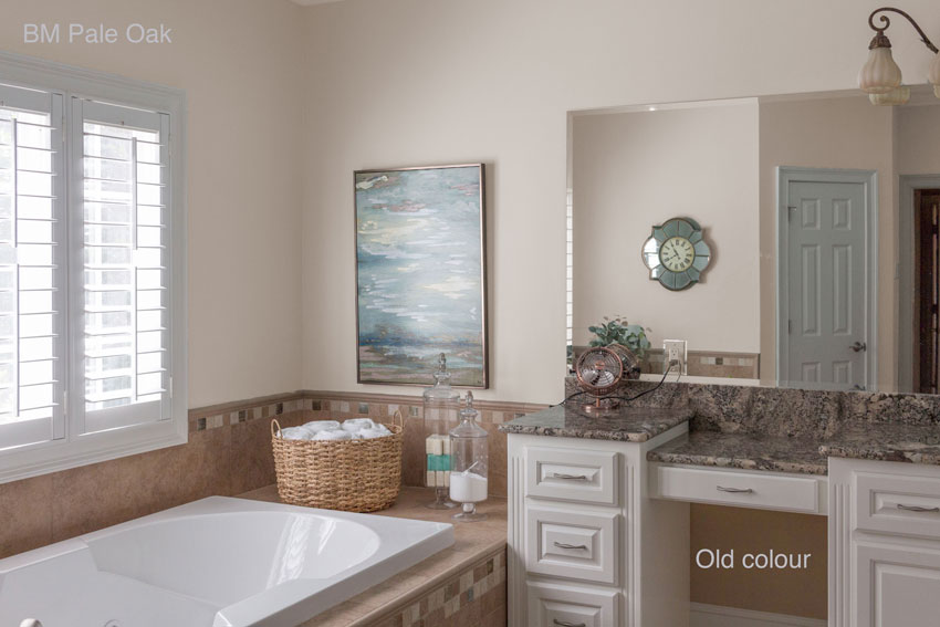
When we discussed this room, we were looking at neutrals to go with the tile and with her help selected Pale Oak for the walls.
However, after she left and we thought it over for a few days, we decided we’d rather have a color on the wall rather than a neutral. On our own, my husband and I narrowed our choices down to HC-139 Salisbury Green. In my mind, we were just going to ignore the pink-beige tile until we renovate (which for this room is probably 5+ years away).
I think HC-139 is a beautiful color, and from some views of the room I really like it. However, when I look at the tub wall and see the green right next to the pink-beige tile, I just cringe because of the clean/dirty issue.
I would LOVE your advice.
So first, I want to give a shout out to the True Colour Expert who chose Pale Oak. Claudia Josephine, with Claudia Josephine Design from Charlotte, NC. She was spot on.
Both Cedar Key and Pale Oak work are good options to consider to update a pink beige bathroom.
They are both in the pale taupe category and have just enough pink in them to read like a neutral grey once they are up, instead of more green if you chose a colour like BM Edgecomb Grey for example.
And this pale green doesn’t bother me either. Also, I love the way you found a piece of art that picks up the pink beige as well as the green. I would just raise it up about 4 inches.
I would personally add some more greenery to this bathroom and keep it green until you renovate.
And, here it is in Pale Oak for those of you who are curious to see what it would look like:
Which one do you prefer?
Thanks for sending in this dilemma!
4. THE COLOUR IS SIMPLY TOO DARK
So first, dramatic colour is definitely on trend. But NOT as a main, all over, neutral. We might be painting our dining or powder rooms colours, navy blue or emerald green, but most people are still looking for light and fresh for the main rooms in the house.
Therefore, if you have recently repainted and the colour is still bothering you? This might be the reason.
5. THE ROOM IS MISSING A LOOK AND A FEEL
I know I sound like a broken record with this. But this AND painting a room WITHOUT having any kind of decorating plan are the two biggest reasons why you’ll suddenly become your new paint colours biggest critic.
Paint simply cannot do all the heavy lifting all by itself.
In this photo (above) the wall colour looks like a green beige, and notice how it’s really not repeated in the decorating anywhere except the artwork.
But the room is so pretty that we barely notice that. This is what decorating can do. In most cases, if you’ve made a colour mistake you can’t fix, focus on decorating. Every room looks better with a little bit of love and careful layering.
But with paint, it’s often an easy fix. You can find comfort that in most cases, with a bit of knowledge, choosing the right colour really is something you can control and it’s actually quite unlikely that the light is working against you. Getting the right undertone and intensity is by far the main thing and light is definitely your friend.
If you have a clean, dirty or lighting problem email me photos here. I like these posts, I think they are super helpful. Let me know if you’d like more of them.
Related posts:
Do’s and Don’ts on Decorating an Empty Room







I just love your posts, Maria. You really are the best at what you do. Someday I will make it to one of your colour workshops! Until then I will glean what I can from your blog. Thank you!
Thanks for the shoutout, Maria! I was happy to hear you felt my choice of Pale Oak was spot on. It just goes to show how effective your True Color Expert course is! I love how much easier it is to chose the best colors.
Maria, thanks so much for your advice on my clean/dirty bathroom! As soon as I read your suggestion of “more greenery” and your next point that “your room is missing a look and a feel – your paint color can’t do all the heavy lifting”, I scrolled back up to my bathroom photo and of course you were 100% correct. I was so focused on whether the paint color was “right” or “wrong” that I forgot that paint isn’t the only tool in my tool box, and it’s time to focus on creating the look and feel with better decorating. Thank you for sharing your knowledge over and over until that lightbulb moment finally comes for your followers! I agree that these reader submissions are great learning tools for us all. Bravo!
Please again post exterior pain colors!
IMHO, excellent tutorial Maria! To answer your question re the bathroom; personally I much prefer the Pale Oak (as you probably know a favourite of Interior Designer Candice Olsen) however on that note, I would also consider what is going on in the rest of the house as far as a colour palette. -Brenda-
Love these questions & answers with photographs. I think I’ll write…I Iove clean colors but I painted the entire interior of our New build home Tapestry because in 31 years of military housing the one house we lived in with colored walls used it. Not my happy color anymore so we’re looking or a redo. OR is there a place on your site to look for your experts by location?
I also would like to see a list of color experts to contact.
Maria,
I’m enjoying these posts so much!
Thank you
Great post! The email questions and pictures really help illustrate your point and I hope you do more posts like this :).
I love the Q&A posts with pictures. I like the clean look in the posts but prefer a muted/dirty color for my own home. I am curious about the bathroom post, aren’t the vanity counter top and bathtub tile both bossy patterns competing for attention.
Yes absolutely, but we were just talking about the wall colour, not to be confused with ‘this is a bathroom to copy’. Thanks for your comment! Maria
Another amazing post!!!! Thank you for all the detailed examples! Please continue with this series of posts.
I LOVE LOVE the photos AND the Photoshop comparisons. They are SO helpful. (As they say, a photo IS indeed worth a thousand words.) Keep ’em coming!
Great post Maria.
You are awesome Maria! These real life posts are so helpful. X
Yes, I want to see more of these posts. Also, posts about layering. And can you tell us what color/brand the Robin’s Egg Blue was?
Loved column. Gave me a lot of insight into my own home and the differences repeats in color make. Now if I could only get the guts to paint my couch to coordinate better with the room especially since want to sell house.
This was a great post. And I love that you include reader’s homes in the examples.
So helpful once again, Maria! Today it helped me feel more secure about what I’m doing with my young girls’ bedroom, a north facing room with little light in an otherwise sun filled home. While noting that I dislike accent walls on principle, I decided a dark accent wall was a decent way to handle this particular bland room and got a wild hair to quickly paint one wall navy. Well I saw it didn’t relate to the green and pink color scheme so I repainted with a blackened green which is less worse but a) too high contrast with the (cream) Navajo white walls in a room with a softer palette and b) the dim cool light kills the color most of the time leaving it just charcoal and not greenish.
Now I’ve taken a step back to actually plan before painting a final time (ha) and while I do actually like the one dark wall, am going to repaint the other walls a light green beige, SW relaxed khaki, to darken them a bit, fit the color palette, and make less high contrast, and am in the process of testing large color samples of medium-dark mossy greens for the accent wall that relate to a large oil painting of garden roses that hangs in their room.
You’ve reminded me especially today that paint can only do so much heavy lifting and to keep that in mind as I choose colors and finish the room!
Great examples and great post, Maria! You demonstrated once again how it’s all in the undertones! And decorating. Well done! ??
Love these posts on paint color dilemmas! Please continue…very helpful.
Hi Maria! You can “colour me happy” when I read your fantastic posts. LOL
Thanks so much for sharing, teaching and inspiring us all!☀️
Yes, please keep these types of posts coming. I always learn something from them.
Kudos Maria! This post was better than any college course! Visual explanations are 100 times better than just verbal explanations. I especially liked the bathroom because in my mind the Pale Oak definitely pulled the room together! Keep these posts coming! Love them!
I love this post, and seeing more like posts would be super helpful. Thank you.
I guess a wardrobe works the same way. A few key pieces can tie things together and make it work. I bought a blue purse, because it was on sale, and it turned out I had that blue in much of my clothing. My wardrobe suddenly felt stylish, intentional, and sophisticated.
Yay, another post from Maria!
I think this is the very best educational post ever. The bathroom redo (second to the last example) truly spells out what you are preaching and I can now understand. ( I should love to see the bathroom decorated with plants to see how that works; can the owner please oblige?) Please do more of these types of examples.
I really look forward to reading these posts, the examples are all so helpful! I have read your books and can’t wait to attend your workshop. When will you be back in the midwest?
Yes !!! More posts like this. Very helpful and interesting. Thank you, Maria.
This was SUPER HELPFUL!!!
Love these posts. They are super helpful. I used your ebook on whites to paint my interior and exterior when we remodeled and I’m extremely happy. Classic gray inside out for our north facing home with tons of floor to ceiling windows. I love it. The only room I really goofed on was the master bedroom. I wanted something different And that one I paid someone to suggest a color. We used BM moonshine which actually does change with the lighting. Sometimes it looks blue gray and others a green gray (pretty but not what I wanted). But I didn’t have a decorating plan for that room so hence the bad call. But I know I can fix it with decorating.
Love love love these posts, so helpful to see a problem and how to fix it. Or avoid it in the first place!
These posts are the best. I’m starting to really see it! …and that in spite of bad monitor color translation. Thanks!
This article was extremely helpful!! I’m always struggling to pick the right paint color for a room.
This is fantastic.
I am bound to “get it”.
Very helpful info!!!
Maria, this is off topic as it’s not about paint color, but I’m wondering if furniture and accessory colors go with white walls, mid-tone wood floors and mixed hardware in black and brushed nickle (fans, lamps, etc.). I’ve seen neutrals in sofas, pillows, chairs, etc., but not seen colors. If color is OK, would it be clean or dirty…or would either work? Maybe a post on this would help others, too….? Thanks much!
I love this post. When I first moved into my home a few years ago, I painted the kitchen what I *thought* was a soft, blue-green. When I got it on the walls, it looked like a 1980s baby-blue nursery. I was certain the issue wasn’t the paint color but the fact that my kitchen/living room has so much bright light. But after reading Maria’s blog and now having her color wheel, today’s post brings home the fact that the paint color was simply too clean and didn’t relate to anything because in the open concept area. This blog has changed how I see color carpet and upholstery, not just paint.
Lighting is absolutely the #2 factor. This is why you can paint walls in an entire home with identical floors/trims the very same color but (with whites/off whites) the paint will change colors in every single room if the lighting/exposure is different – which in 99% of homes of course, the exposures are different. #1 reason why every single powder room will look grey-ish if you just slap up some generic white/light off white. Or even primer. Or even the most ultra white which gives you light bluish grey. Unfortunately the only solution is to go to a deeper “color” or wallpaper! And add super bright lighting.
Maria, I have seen you say not to use a grey undertone as your default neutral. Can you expound on this? I need to paint, now, and my eye seems to always be pleased with the blue-greys! Also, I place your color wheel on my “beige” leather furniture and still cannot determine the undertone 100%! Taupe looks pink next to it…could it be a grey-green? My house walls are a hodgepodge and it is driving me crazy! ) :
Hi Val, did you add the colour chips onto the wheel to make it 100% accurate? That URL can be found at the back of the wheel. And if you have photos of your dilemma send them to [email protected]. I would love to write a post with photos of a reader using my colour wheel! There’s nothing wrong with grey as long as your entire home is not grey on grey on grey. Hope that helps, Maria
This is one of the best and most helpful articles I’ve seen on your site. It addresses so many issues and the illustrations are so ah ha. Thanks
What is the best way to identify the undertone?
Order my free colour wheel or buy my ebooks, that’s the best training 🙂 Maria
So we purchased a light gray (BM Pearl River – 871) for our bathroom and after painting our walls discovered it has a definite blueish tint to it that we didn’t see in the swatch and isn’t what we wanted. Any thoughts on this? It’s interesting though, because when I take a picture of the walls with my phone, the walls look more gray as we expected! But more blueish to the naked eye.
Thanks for posting this comment because it further validates the point of this post 🙂 Pearl River is indeed blue which is why it’s blue on your walls. If you were a blue person, you’d see it as perfect (as long as it actually matches your bathroom finishes) some people don’t see a grey as grey at all unless it reads blue. However you obviously prefer more of a greige look which is in more in the realm of a green grey, this post will help clarify this further: https://mariakillam.com/9neutralundertones/
Bottom line whether you like blue or not, if there is no blue in your bathroom finishes, you won’t be happy with it. I can help you find the right colour through my eDesign packages or my ebook How to Choose Paint colours could also help! Thanks for your comment, Maria
maria, your examples are so relatable bc they are frequent mistakes and when u photoshop, it really makes it crystal clear.
my dilemma at this point, since i have not taken your course yet, is that the colors you’ve provided here are extremely different than the color wheel albeit i remember you said that the color wheel is undertones not color.
this is what makes it so confusing for me at this point bc i think i get what u are saying then i get the color wheel and do not see the undertone in the color, ugh! also, i am not able to download the Go To List and 12 Ways. can u explain please.
My neutral colour wheel will not tell you which colours to choose, it will help you identify the existing undertones in the room so you can choose the correct neutral if that’s what you want to do.
In the world of interior design, there’s nothing that will give you ‘the answer’ on its own. The regular primary colour wheel is even worse, it will also not help you choose a paint colour.
I can help through my eDesign department if you are stuck. http://www.mariakillam.com/shop-landing-page/#interior-solutions
Thanks for your comment, Maria
This is super helpful! I painted my home office BM Crystal Blue, and have been agonizing over whether I made the right choice… the colour tends to wash out and look beige-ish over the course of the day. It’s quite possible that my relative lack of décor (new house, no art on the walls yet!), beige area rug (IKEA Snaptum), and brown woodwork (original oak trim from the 1900s) are all contributing to the Crystal Blue seeming to wash out over the day. I love colour and really want a blue/green type of space, so I’ll try incorporating décor in my desired colour palette to see if it helps. 🙂 And I can always repaint if it still doesn’t work!
Thank You Maria
I find these posts SUPER Helpful..Hope to see more!
Stay safe!
Hi Maria. I have recently found you. Your blogs have been massively helpful and I’ve learned so much from them. I have spent most of this year painting then painting and painting and sample after sample waisting money I don’t have. This is actually starting to upset me as I don’t seem to be able to resolve. I’m hoping that you might be able to offer me some tips. I have a West facing kitchen. It’s quite dark especially at one end. I have now tried so many colours it’s unbelievable. They all seem to change colour and its not good, they tend to get browny yellowy tones in them making it look dirty. I’ve tried green greys, beige greys and yellow beiges. Today I was convinced that the conifer that was blocking a lot of light was causing the issue. So off I went with my saw and chopped down the offending tree. Now this let in a lot more light it dint alter the way the colour looks. Could you please offer me some insight. I’m happy with any colour choice at this point. Just to add I have white kitchen cabinets with wood worktop and a oak dining table. Many thanks
Hi Maria. I have recently found you. Your blogs have been massively helpful and I’ve learned so much from them. I have spent most of this year painting then painting and painting and sample after sample wasting money I don’t have. This is actually starting to upset me as I don’t seem to be able to resolve. I’m hoping that you might be able to offer me some tips. I have a West facing kitchen. It’s quite dark especially at one end. I have now tried so many colours it’s unbelievable. They all seem to change colour and its not good, they tend to get browny yellowy tones in them making it look dirty. I’ve tried green greys, beige greys and yellow beiges. Today I was convinced that the conifer that was blocking a lot of light was causing the issue. So off I went with my saw and chopped down the offending tree. Now this let in a lot more light it didn’t t alter the way the colour looks. Could you please offer me some insight. I’m happy with any colour choice at this point. Just to add I have white kitchen cabinets with wood worktop and a oak dining table. Many thanks
Maria, you mention that, “Many designers handle this by simply choosing one go-to neutral and every single client gets the same colour.” This was very interesting to actually read.. I am curious to learn then, which are the typical go-to neutrals designers use? The one I know for a fact is Pale Oak..designers Love to use this one over and over again.
Light doesn’t change a color’s undertone, but it can affect the value ( I think that’s the term I’m looking for). I painted Behr’s Paris Rain in a spare bedroom with a south-facing window. It’s a light blue-gray. One friend described it as “too cool for a bedroom.” I like it, though. So I used the same color in the basement, which does get some outside light but not a lot and not as much as the bedroom. The paint color looked much more saturated. I worried it would look like a baby blue. However, taking Maria’s advice that walls need to be decorated, I added a large mirror, art and put the furniture back in. The room looked great. But it definitely does not look like the same color paint as in the spare bedroom.
We have a color issue that is definitely the lighting. Our laundry room has no natural light. Paint colors look unpredictability different, and it’s a challenge to find a good color. For example, a color that looks almost white in every other room looks dark army green in the laundry room. The pale blue/green looks dark, murky slate blue in the laundry room. Every color sample I buy looks completely different, and I’m at a loss. I might just go with wallpaper 😄 Other objects in the room show their normal color. It’s just paint that is unpredictable 🤷