The problem with your room isn’t always the paint colour. Often, it’s that the room hasn’t been styled yet. And a good designer can recognize the difference.
There’s almost nothing that makes me happier than styling a room which is really when the look and feel or another way of saying it–atmosphere–enters the room.
You can fill a house with very expensive furniture, but if the decorating ends there, without the artwork, accessories, area rugs, and lamps, it feels. . . flat and unfinished.
Before you blame the paint colour, try decorating.
Whenever I ask for ‘Ask Maria’ photos, often I’ll receive pictures of rooms where readers think that the problem with the room is with the wall colour, but really it’s simply that the room has not been styled yet.
I spend a lot of time teaching styling in my Specify Colour with Confidence events. When you leave my workshops, not only do you suddenly have confidence to choose the right colour for everything from paint colours to countertops, you also leave a better decorator.
My friend Sheryl Stephenson is a Mom, artist, and a professor who also happens to be my personal trainer at Innovative Fitness in Abbotsford (owned by my sister Elizabeth and her husband Bill).
Sheryl and her husband have four beautiful children, however, they are almost all out of the house, so they recently moved into a smaller home they had built in Aldergrove.
She asked if I’d come over and help with her dining room.
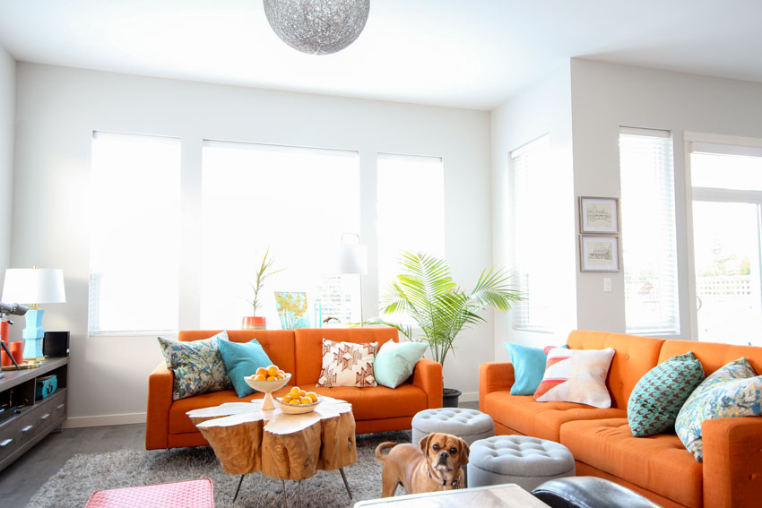
Styling this Chic Mid Century Modern Home
During my consultation with her, we chose a new table, dining chairs and a new light fixture. That day, we also went out shopping for a few accessories, her living room didn’t need much.
And then when I arrived to photograph her fabulous and colourful interior, I brought a few more vases, throw pillows and lamps to complete the look.
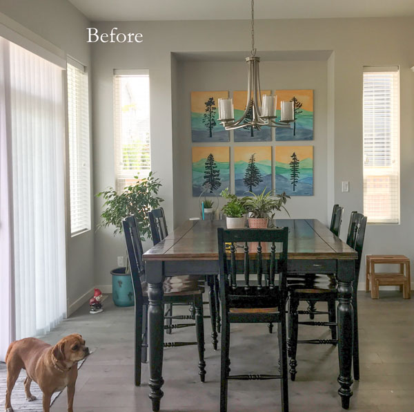
Here are the before and afters:
After – Sheryl’s dog Luna | Paint Colour SW Crushed Ice
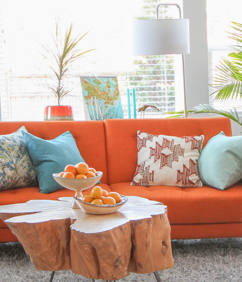
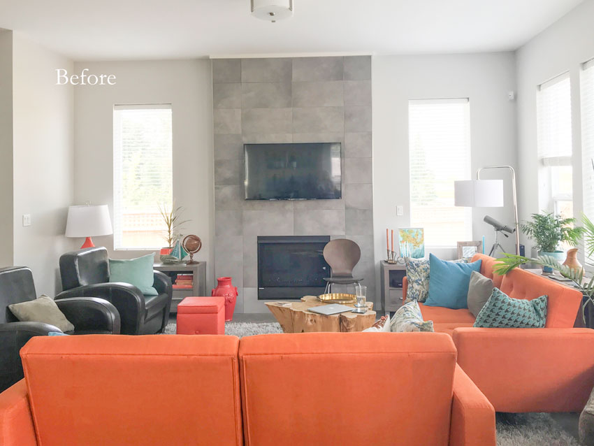
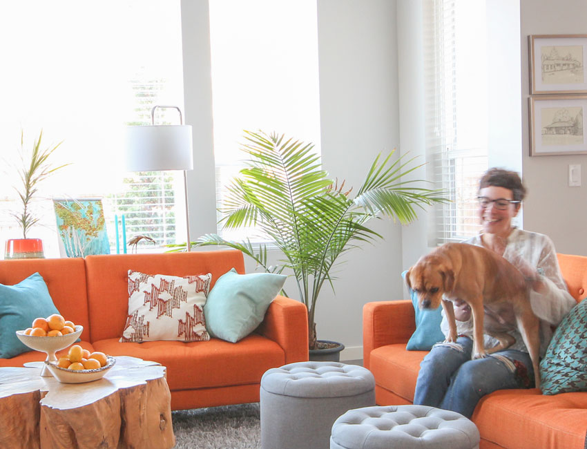
Sheryl and her husband Tim both love orange, so they both agreed that was the perfect colour for the sofas in their new build.
Did you know orange is the colour of joy, sunshine, enthusiasm, creativity, success and health? Orange is also the colour of social connection. So, if you’d like to have more friends in your life, introduce some orange into your home (or peach, which is back on trend).
It’s also the perfect mid-century modern colour combined with bright blues and turquoise!
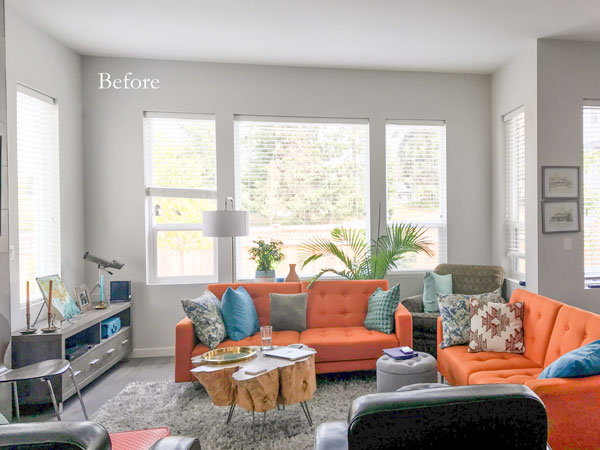
Before
Sheryl found the stump down the road from where she used to live with the intention of turning it into a coffee table someday. Their new house was the perfect time!
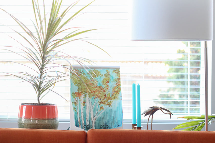
This is one of Sheryl’s pieces (below). I love the casual–I-just-finished-painting-this–feel of the trees on a pad of paper, propped up on a stand. I decided it should be front and center above her sofa (below).
This house has the perfect combination of cool and warm. Nothing brings grey to life faster than colour!
Read more: 4 Ways to Decorate around your Charcoal Sofa
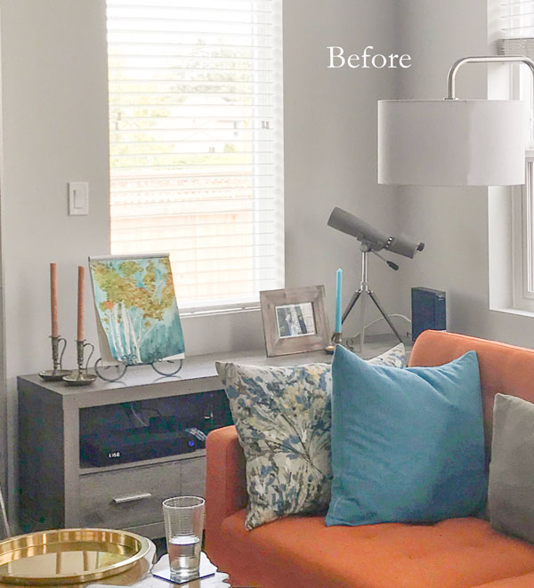
Before
Sheryl’s dining room needed another hit of orange so I moved the orange lamp from this room and installed the blue lamps on the cabinets flanking the fireplace.
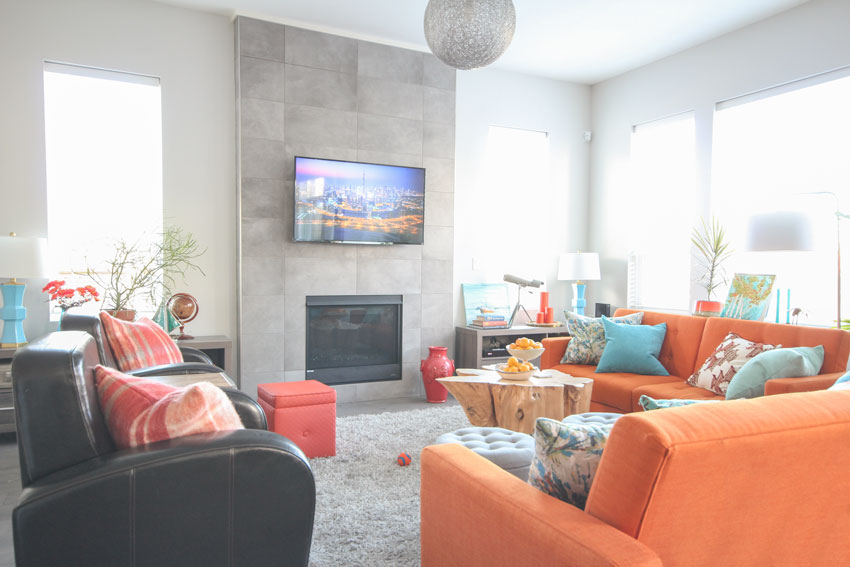
After
Before
After
I found more of Sheryl’s artwork in the hallway so I included it in this vignette (above).
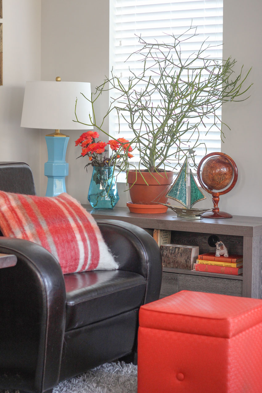
A pencil cactus just belongs in this style of interior, doesn’t it. I had this one out on my deck all summer and it got too big to display in my house, so I asked Sheryl if she wanted it. It’s perfect right here.
Mid Century Dining Room Style
The dining room had the biggest transformation.
The countrified counter-stool height dining table came from their last house. She knew it wasn’t right but wasn’t sure what to buy, which is why I was there to help. And this is where a professional designer can save you money… we can save you from buying the wrong thing.
Sheryl and her husband Tim both love the outdoors which is evident by the artwork she painted for the dining room – all trees from the mountains of BC.
The builder light fixture also had to go. I like how the new black chandelier visually relates to the black trees in the artwork.
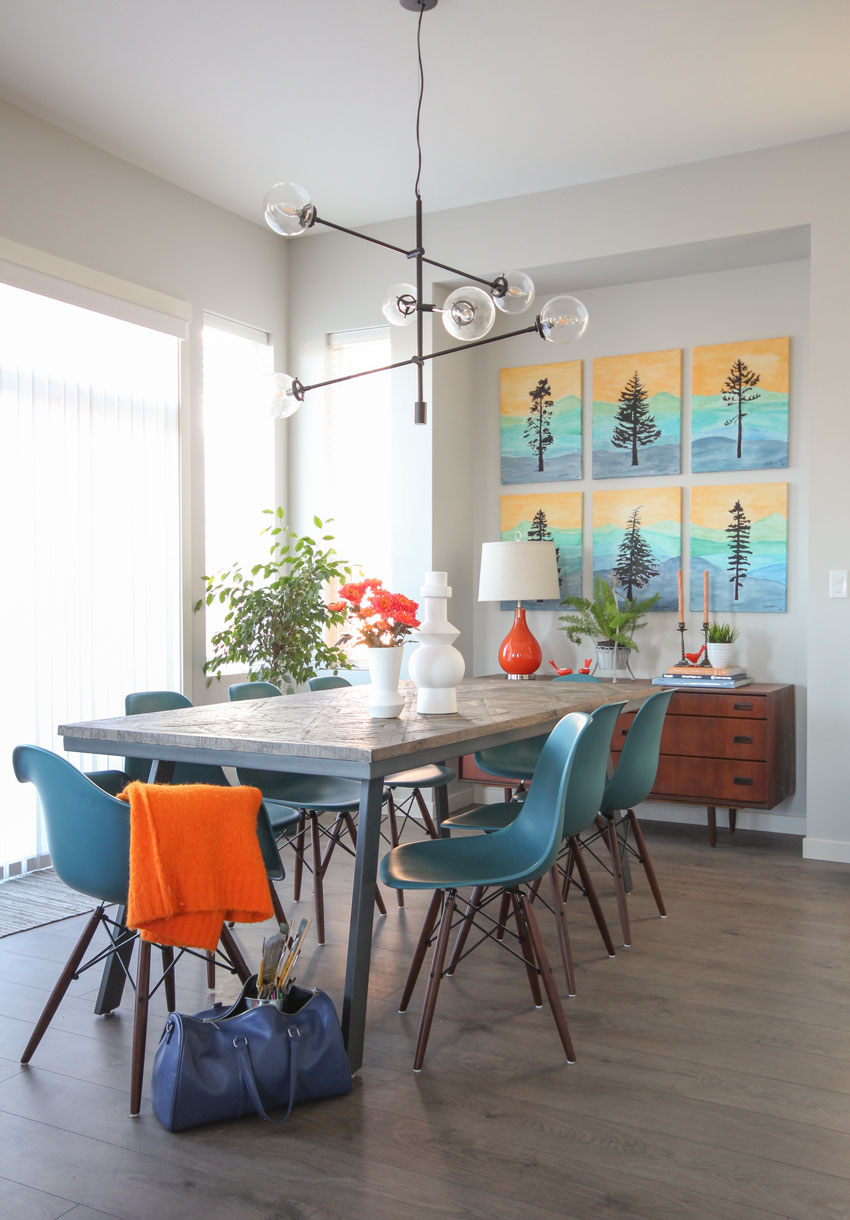
After | Eiffel Chairs | Dining Table | Chandelier
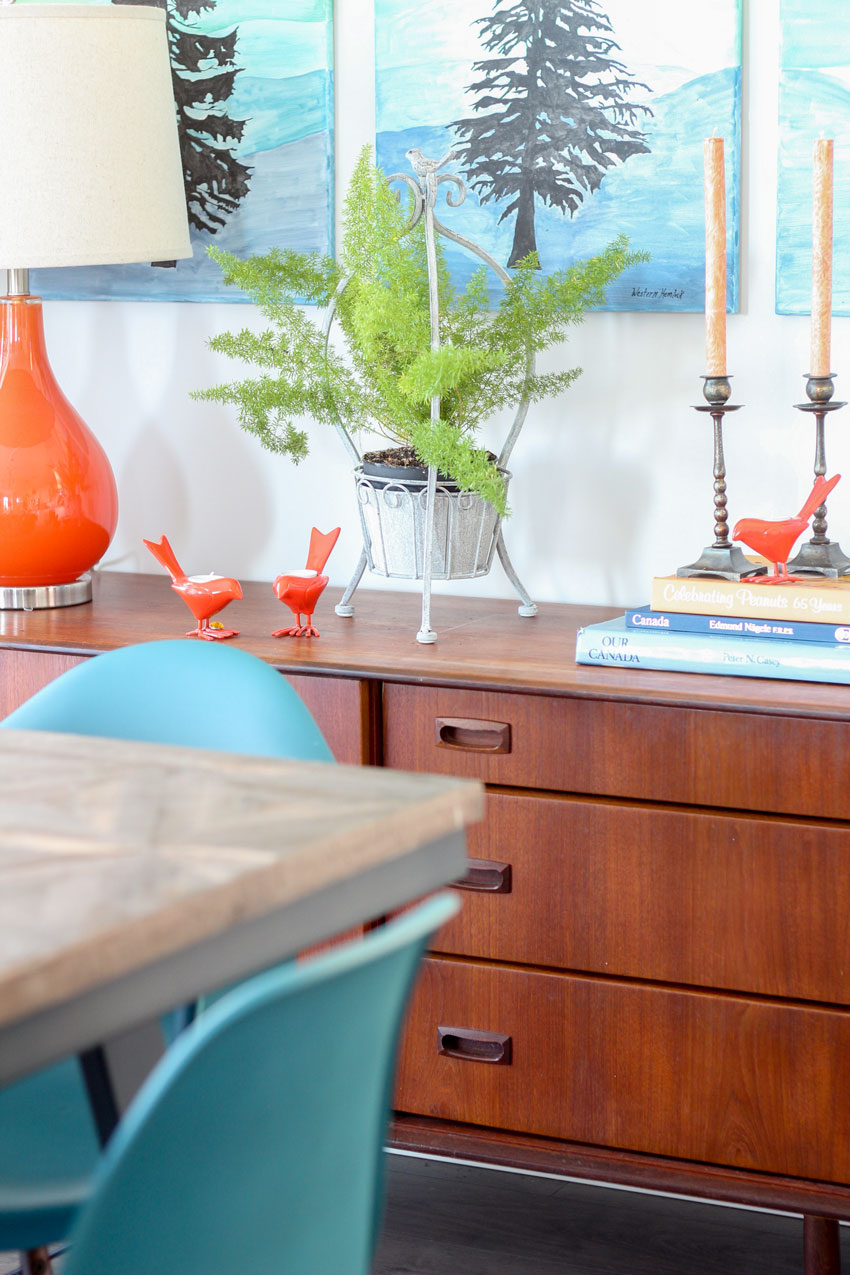
Vintage sideboard
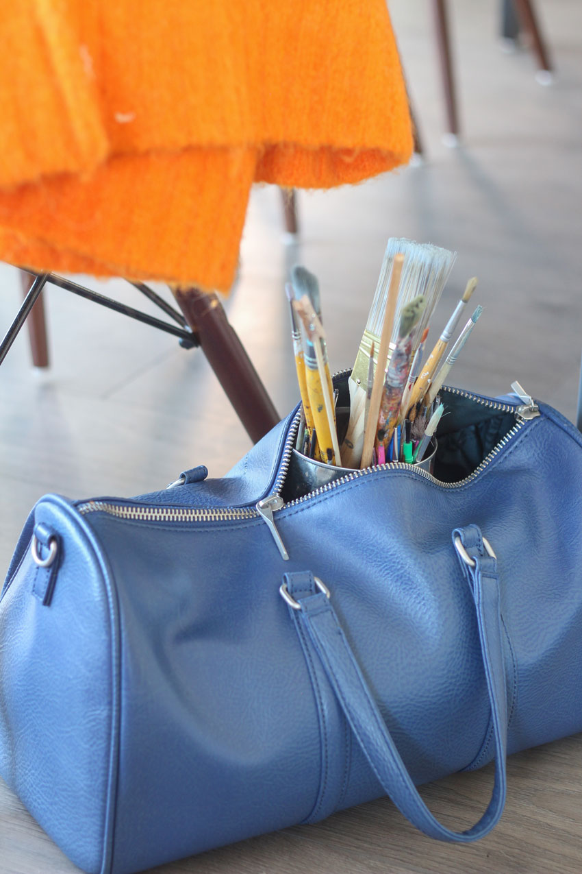
A few of Sheryl’s artist brushes.
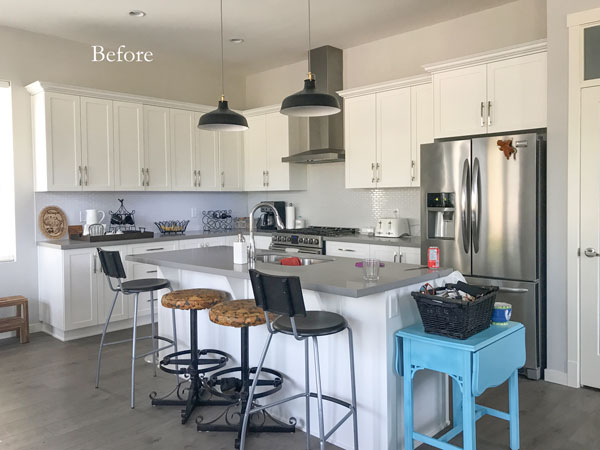
Adding colour to the kitchen.
Sheryl’s kitchen really needed colour! She loved the two counter stools she found on Craigslist, so I suggested adding chairs that were similar in height and look.
She had already replaced the builder lights with these ones from IKEA.
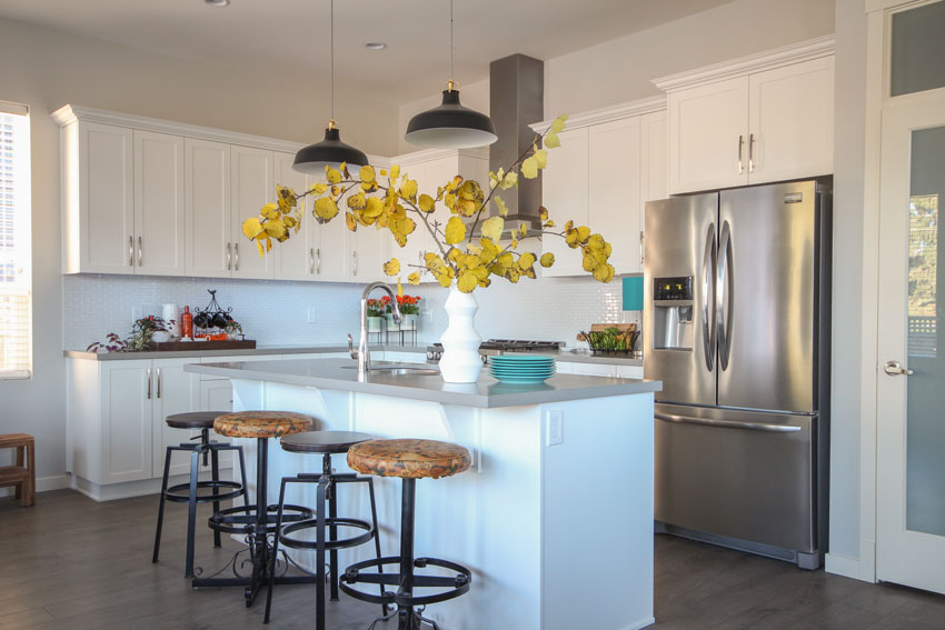
After (new counter stools similar)
Every kitchen needs a small table lamp somewhere (below). It’s one of 5 lamps everyone should have in their homes.
Photography by Maria Killam
I love the classic and timeless small-scale subway tile Sheryl chose for her kitchen.
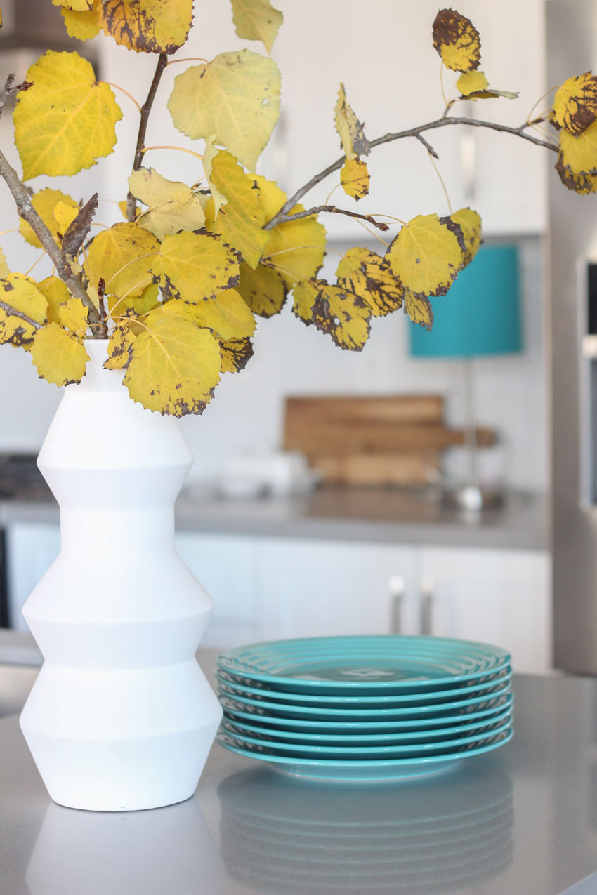
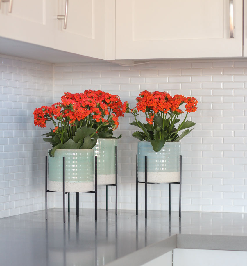
We found these fabulous plant pots (above) on our first trip to HomeSense. They are the perfect focal point for this kitchen, and are a great way to repeat the orange from the living room with potted plants.
Kalanchoes are one of my favourite styling plants because they last a long time (usually approximately one month).
Sheryl with her dog Luna!
Sheryl confided now that her home is finished, and her dining room is complete, she’s actually looking forward to having people over! That’s the best result of all!
Living in a beautiful home makes everyday feel like a luxury.
If you would like your house to fill you with happiness when you walk in the door, check out our Get me Started eDesign packages here. If you live in the lower mainland, I also make house calls!
Related posts:
The Minimalist Guide to Decorating with Charcoal
Style Your Home Like the Pros by Using the Triangle Principle


Love your attention to detail — the turquoise plates, orange Kalanchoes, pencil cactus, throw pillows, etc. A beautiful transformation, as always!
Beautiful touches…quick question. I noticed the removal of the toaster and coffee maker. We grind and brew coffee daily so removal is not an option. Any suggestions for placement.
I have always kept my toaster on a tray in a cabinet (for the crumbs). In this case, they were both removed because we were styling the kitchen. Maria
I love love love the orange couches and vivid colors. This room shows you don’t need all neutrals for a homey feel! Great job!
Maria you are so good at what you do. I love all of it. Had to laugh at the before vignette. That’s me! Then your after vignette is divine. Thanks for sharing. I must send you a picture of my duvet.
You found your tree branch–hooray! 😉 The room turned out beautifully. She already had such great pieces to work with and the choice of orange sofas truly make the room. Love the blue and orange combo!
Looks very cute. MCM is one of my favorite design styles. Where did she manage to find an orange sofa?
Thanks Mary! She bought them from Wayfair! Maria
Beautiful! I learn so much from your styling, Maria.
Wayfair for the win! I LOVE orange. I used orange and eggplant chairs (no sofa) in our MCM style living room in 2017. My sources for all my new furniture were Wayfair, Overstock, Walmart.com and Amazon, so I’m not surprised she got her orange sofa from Wayfair. If you want color and don’t want to wait or pay for custom, it’s the way to go. They all carry many of the same items (just different names), so shopping and comparing all four can get you some great deals.
I too love orange and I love the way you styled each room and created flow with orange and teal. The rooms have a consistent flow of color. Some of the subtle changes you made in the living room really make the room pop.
I agree on a table lamp in the kitchen. I love the subtle light they add, and are a nice way to introduce subtle light in the morning before I’ve had my coffee. In the kitchen you removed all the appliances and the blue side table. Did you find another home for the side table? Where do the coffee maker and toaster live after styling the kitchen? I’m curious how I could rearrange my kitchen’s appliances so that they are not the eye-sore on the counter.
Hi Michelle, I put my toaster & keurig on a tray tucked under the counter, then just had to pop it up in the morning. The tray keep any crumbs from spreading around, as well. When I renovated, I had an appliance garage built so everything is hidden behind a door. This way my counters are clear and my kitchen shines. Hope this helps!
This is a beautiful transformation! I love the bold use of orange! To my eyes the living room would benefit from some floor length curtains. Perhaps in the same color as the wall, or, with some orange and turquoise accents. All around just beautiful!
Wow Maria you really pulled the house together! The orange, teal, and shades of blue make you happy just to walk in the house! You did a great job repeating color throughout. I always have to laugh at the sputnik type of chandeliers but it really does work in a mcm house. I have one question though. Would you have put the white subway tile with the ivory painted cabinets? It looks like a clean dirty combination or maybe it is my computer. Also love the green plants you incorporated! Great job as usual!
Thanks Lucy, actually the backsplash tile didn’t appear to be different whites when I was there. . . it might just be the lighting, I have trouble photographing white kitchens because I am still an amateur photographer 🙂 Thanks for your comment! Maria
Love all the color in this space! I am thinking to add plants to my kitchen and that raised planter/pots is very eye catching. Also considering a grow light/planter setup for herbs. Whatever I end up with we have to make sure it is cat friendly!
Oh I love this. It’s like my office only I have a different blue accent and barn wood. I have an accent wall that looks like lattice. Wish I could slow you my photos cause I am having trouble trying to decide what to repaint the lattice color.
Oh my goodness how stunning, she must be thrilled.
I especially love that you chose the sofas to work with the MCM style home.
Turquoise and orange certainly is a mid century classic colour, and it’s absolutely perfect here!
xo
Beautiful home and greats to try.
Looking more – what are your thoughts on not having an end table? I have a hard time seeing where drinks are going to go during entertaining for that sofa that is parallel to the fireplace. Hum…
Her husbands chair (seen in the corner in the before pic) might come back into the room because it’s comfy which is why there is no end table. This is real life 🙂 Thanks for your comment!
Yeah 😉 And hey that is why small trays and ottomans are good partners right?
Wow, everything looks amazing, you’ve really brought the rooms to life! We keep our toaster oven on the counter as we use it very frequently throughout the week, but its such an eyesore, and none of the cabinets in our small kitchen can store it, plus its much bigger & heftier than moving a small toaster. I don’t know if its goofy to put a cover over it, because that might make it stand out even more. I know my hubby would be baffled if I put a cover over it lol but he already thinks I’m crazy..so..
I love the colors in this house. Your finishing touches make it perfect.
I have a beautiful home on Quesnel Lake in BC’s Caribou region. My downfall seems to be having the ability to add bright color to my dining and living rooms. Presently, they reflect a peaceful calmness that I love. Living room colors are Cloud White on the walls, a stone colored couch, blue stone coffee table, taupe and soft simmering gold in the side chair and in the Buddha print on the wall and draperies, soft peach and cream in the Bergere chair, and a soft stone colored upholstered bench. The floor is a mid walnut color. Would deep purple work as a complimentary color for cushions, etc.?
Hi Joan,
It’s hard to say without photos but peach and purple are pretty together for sure! However, make sure you add it in 3 gradations of small, medium and large. Just introducing purple in throw pillows will not look properly pulled together! Hope that helps, Maria
Any info available on the floor? Is it a brown grey LVP? I love it with the pops of color!