I was delighted to visit my childhood friend recently and help her with a living room refresh. To visualize a colour palette before we shopped for a new area rug, I created a few simple design boards (nothing fancy). This is an exercise I think EVERYONE should do before shopping for an area rug, so I’m sharing the process with you.
When my family and I stayed in Miracle Beach in September, my best friend from elementary school posted a comment that she was 20 minutes away in Courtenay. She had just moved and was a first-time homeowner! Hooray!
Nancy and I have seen each other a few times over the years, so I dropped by for a visit. Since I knew we were coming back here again at the end of October for a week with Terreeia and my Mom (attending the health retreat) I offered to help her decorate.
Living Room Refresh
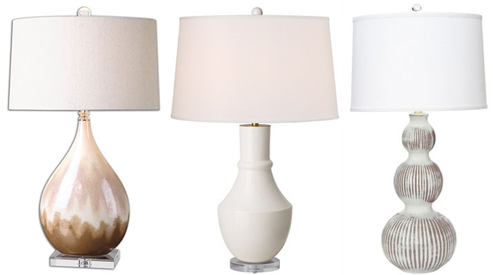
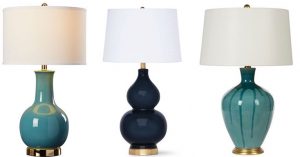
Nancy and her partner’s budget was already stretched to the max buying their first home so I helped out with the lamps. You won’t be surprised to hear this since I’m obsessed and no one ever has enough. 😉
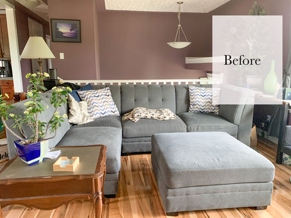
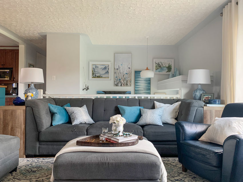
This is what their place looked like the day I was there (also keep in mind they had recently moved). The first thing that had to change was the paint colour!
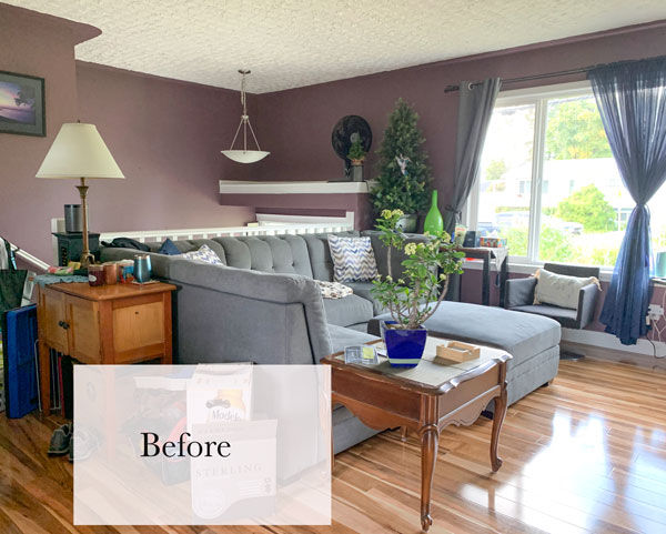
Notice the matching grey curtains to her grey sectional sofa (I just mentioned this in last week’s post about how not to decorate with a dark sofa).
Start with a Design Board
The first thing Nancy needed was an area rug, so I placed her existing furniture (including two navy leather chairs that were on the way) onto a powerpoint slide and added some throw pillows. THIS is exactly what you should do if you’re looking for an area rug to coordinate with existing furniture.
So often, I see clients paralyzed with indecision about choosing an area rug so much that they live for years with a placeholder shag from Costco (I know you think I’m talking about you, but this just tells you how many times I’ve seen it!)
When you have no idea where to begin, this exercise is a great way to visualize your living room space.
Remember my decorating advice in this post? Your living room should have a textile pattern that repeats your sofa colour and also pulls in colour and contrast. Notice that since Nancy’s sofa is on the darker side, both rug selections are much lighter and fresher to create contrast.
She said turquoise was her favourite colour, so I created two different design boards.
Trendy Cognac and Cream
Here is the first design board in a more trendy colour scheme. We’ve been talking about cognac a lot recently and I love how it warms up grey.
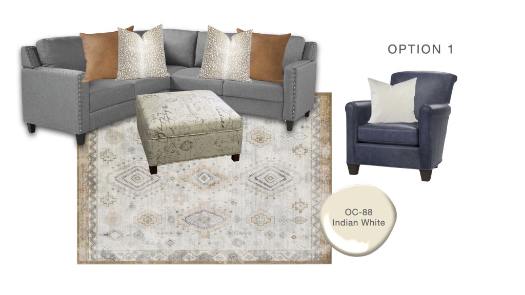
Charcoal Sectional | Cognac pillow | Ottoman | Area Rug | Antelope pillow | Navy Leather Arm Chair
Now, see how easy it is to coordinate a few lamps with your new living room? A design board helps you pull it all together.
Beautiful Blend of Blues
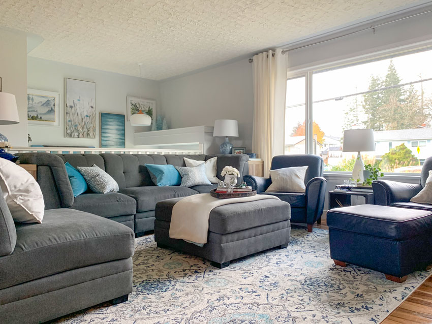
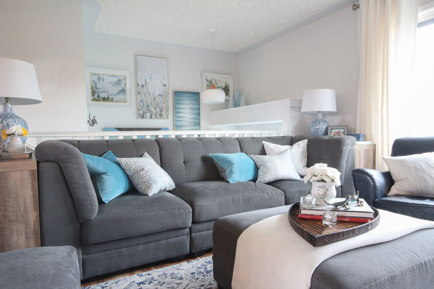
Nancy ended up choosing this design board because she loved the mix of turquoise with hints of navy and charcoal:
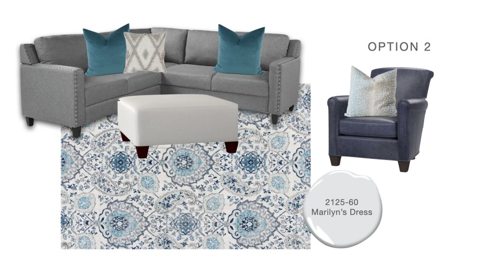
Charcoal Sectional | Leather Ottoman | Teal Velvet Pillow | Antelope Pillow
Turquoise Rug | Boho Pillow and Similar Pillow | Navy Leather Arm Chair
Remember what the room looked like before? It needed new paint colours ASAP. Plus, because the colour wrapped onto the ceiling, the dark purple really overwhelmed the space.
Before
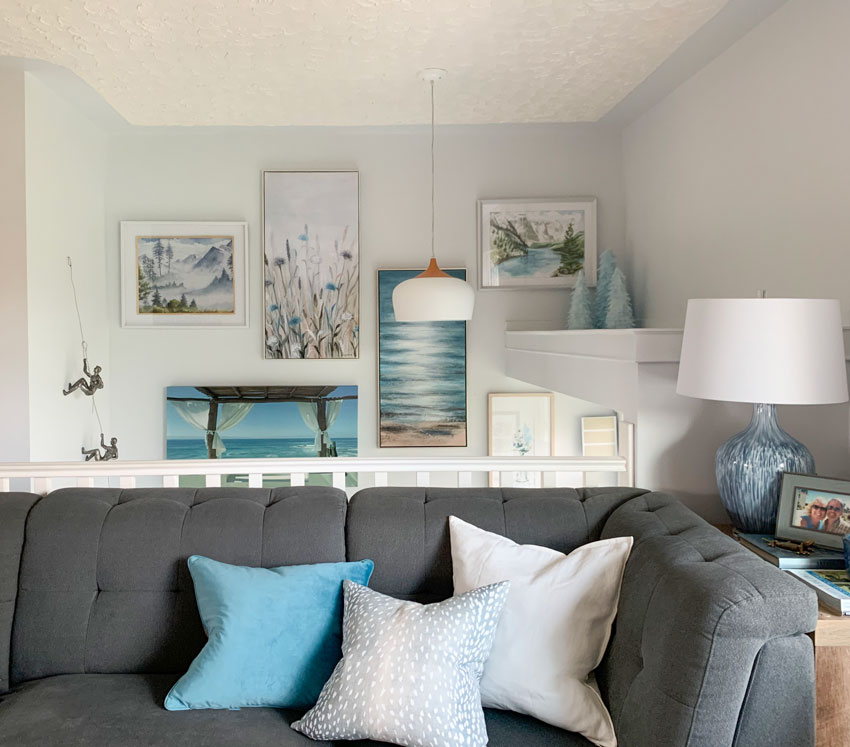
And here’s a look at her living room after with a new paint colour, new white grommet drapes (from IKEA), new lamps (Homesense), and artwork in the split level entry.
After
Before
After
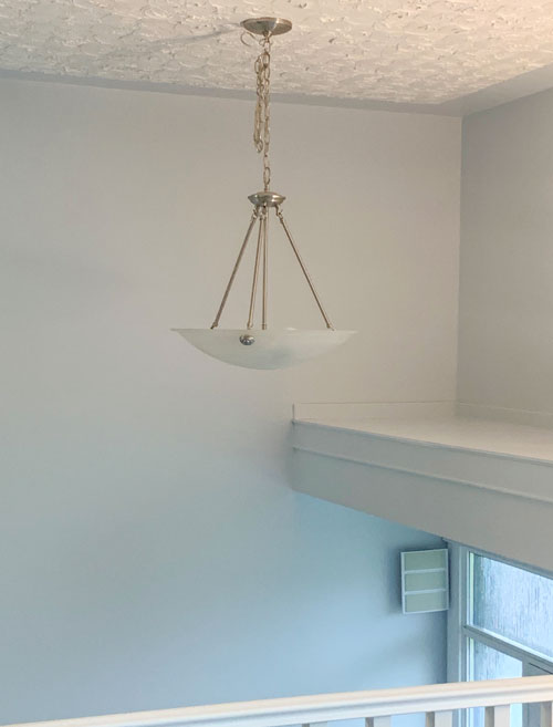
This is her split level entry (below). I’ll save the tutorial on hanging art precariously on a ladder for another day 🙂
This dome pendant is opaque and perfect for an entry that is visible from the living room. It’s lovely because there’s no glare from the globe. I don’t know about you, but I don’t want an entry light to bother me when I’m sitting in the living room. When this light is on, only what’s below it is illuminated.
Nancy said it was especially annoying in the morning when someone was leaving the house and the other was sitting in the living room having a peaceful morning!
Before
Mountain climbers | Opaque Dome Pendant
Again, it’s so much easier to choose a wall colour in the context of your furnishings and decor. In this case, Nancy needed a new area rug, so that gave us an opportunity to create a starting point for her living room colour palette – BEFORE we settled on a wall colour. And the design board helped Nancy visualize her existing furnishings with new accent colours.
Choosing your wall colour first, before you’ve shopped for your accessories or created a design plan for your space is one of the biggest mistakes I see. And, it can leave you asking, “What happened to my paint colour?“
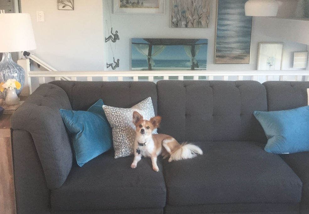
Here’s my sweet friend Nancy (below) and her Papillon Charlie (above):

Nancy Rutherford & Maria
Being in Campbell River with Terreeia and my Mom was fabulous and then I got to be the decorating fairy as well as bond with my childhood friend!
If you’d like your living room to fill you with joy when you walk in the door, check out my paint/decorating packages here.
Related post:
Stop Buying the Neutral Sofa on the Showroom Floor
Make Your Living Room the Star with my New eDesign Add Ons
What is the Best Colour for Living Room Furniture? An eDesign Before and After


Maria nice transformation !
Really like the new look .
I’m sure she was very appreciative your a great friend
Nancy
I love the pendant in the entry! Can you do a post with suggestions for replacing the “boob” light fixture in an entry way when you can’t have something that hangs down very far because the front door will get in the way when you open it.
Yes, Sarah! I need to see something for my “boob” light entry, too!
Hi, Pauline…I think Maria already did a segment on decorating mantels. So you may want to look in previous posts. Hope you can find. 🙂
Maria – I love that you did this for a childhood friend. You are my decorating hero. I enjoy your generous posts and hope someday to reach out and hire you for my own happy ending in a home. Best. Marie Stewart
That’s Beautiful Maria! Will you be my new best friend!?😂❤️
Wonderful transformation!
These pictures are a great example of where I struggle: the couch looks like a different color in each one — almost charcoal in some pictures, and more of a medium gray in others. How do we shop online for coordinating pillows, rugs, lamps if our own pictures are lying to us? And how do you trust that the color you see online isn’t lying too? (Clearly I’m not a decorator, but I still enjoy and try to learn from your blog.)
I love it! So colorful! I thank you Maria for always sharing advice with others on this blog. I just love reading it and seeing the transformations that you have done.
The ceiling looks five feet higher!
Would you be my friend lol . What a remarkable difference. Lovely Maris
The change is amazing.
Lovely transformation. You make it look so easy! 🙂
Absolutely Beautiful! Looks so comfortable and refreshing. I really appreciate your posts and advice.
Maria what a difference! I *think* you probably forgot that you went to school in London with me. I now live in NY so whenever you’re visiting the area, my living room will be waiting too hehe. Any chance you could do a segment on how to decorate your fireplace mantle? Would looooove that. Stay safe 🙂
Maria, what a sweet and generous friend you are! This transformation is just amazing. I love how you shared your thought process and the two design boards.
What a difference you made for your friend. It’s so lovely and warm!
Beautiful and delightful!!
The mountain climbers are quirky and cute! They look like a conversation starter.
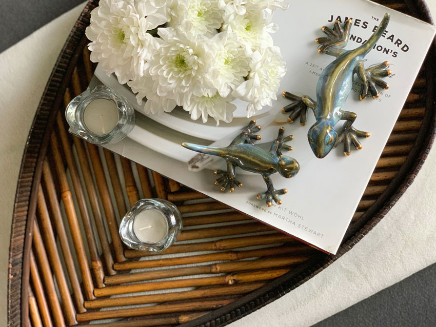
I think we all want to be your new BFF, Maria!! 😀 You did such a lovely thing for Nancy, making both her and her living room happy. Congratulations on your new home, Nancy. I would have picked the turquoise theme too. I’m glad you changed out the “flycatcher” light in the entry. They all go there to die and show through the frosted glass, and then you have to figure out how to get rid of them…on a precarious ladder. Your mountain climbers and salamander pair are such fun accessories. Well done!
So lovely. Will the ceiling be repainted later? Curious; is there a reason why you kept the wall colour on the ceiling band and didn’t paint the ceiling colour to the edge of the walls? Either way 20 bazillion times better.
Oh my what a stunning room!! Incredible transformation. Laughed out loud at the “paralyzed with indecision that you get the shag carpet from Costco” as yes, that is me going on 5 years just the rug was from Havertys & it’s the same color as the couch. Ugh.
So love this post!! Would love to see more detailed posts on how to create design board since Maria says it is the key to a strong beginning and foundational.
Love the transformation. Did the sofa have an ottoman attached at the end to make it into a chaise? I like the way the new sofa/chaise combo can be disconnected and the “bumper” can just be used as an ottoman. Anyway the artwork and accessories brought everything together artfully. I am sure she is happy with the results and so glad to see you again. Nice results!
That is a great transformation! Looks so light and bright now!
The artwork really makes a huge difference! I like the sizes, colors, arrangement, and images. Where did the artwork come from? I keep looking at the bare before wall and the art covered after photo feeling both excited and settled. I like it!
Many friends and family have some shade of grey furniture and decor in their homes. It’s really nice to see color brought in! Most everyone, after painting walls grey to match trends, have experimented with soft surfaces to achieve their ‘happy’ with color. One friend brought in soft blues and golds to perfectly compliment the grey neutrals in her new home. Another brought in true yellows. It’s been fun watching people make grey work for them, both here in your blog and in my life. I’ve incorporated some grey in the form of end tables, soft bedding and rug patterns. Definitely as neutral additions and not my main color background. I don’t like to see everything installed in tones of grey. It looks unfinished.
Wow! This is a beautiful transformation! What did you use for the side tables? They look like they might be bookshelves.
Yes they were bargain priced cube bookshelves from Walmart! Maria