Today I am delighted to share a gorgeous and joyful living room decorating edesign before & after.
“I have been using Maria’s eDesign services for years. I love her aesthetic and she provides so much value. I had Maria provide a plan for a large upstairs living area that had outgrown being the kids’ play area. I would have spent years in indecision trying to figure out what furniture to buy, what colors to choose and match, how to arrange the furniture and then finally how to make it pretty.
The eDesign plan eliminated all the big decisions so I could purchase with confidence and allowed me to focus on making the space pretty. All of the visual inspiration that comes with the eDesign package made that so easy.
The extra value comes from absorbing all of Maria’s wonderful knowledge about the details like lamps, vignettes, and art (oh my!). The foundation that ties it all together so perfectly? Maria’s absolutely expert color specifications. She’s never wrong and that’s why I keep going back for more.” ~ Patience
Designer Living Room Makeover via eDesign
Patience is a long time client and follower who loves to decorate. Using my Get Me Started decorating eDesign package, she wanted to tackle her underused upstairs living room.
This is what she had to say about the space:
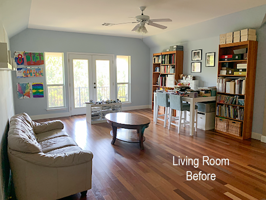
“This room was the kids playroom and mostly housed toys. They have grown out of toys (except for some legos) so it is time to change things a bit. I am still going through everything in the room to clean it out as you will see from the pictures, but I would like to start from a blank slate.
This room is an upstairs living area that does not get used very much even though it is a nice room. There is a balcony porch onto the back of the house through the doors in this room and the opposite wall is a hallway/pass through of sorts to the kids bedrooms. So, this room is seen very often even if I don’t actually spend a lot of time in it.
I have no plans for a TV or fireplace although I would like a gallery wall. It should be more casual. There isn’t a lot of storage upstairs, so it would be nice to have some storage (for books, etc). It would also be nice to have a workspace for the kids to do projects and such. I am hoping that having this room styled will motivate me to use it more.”
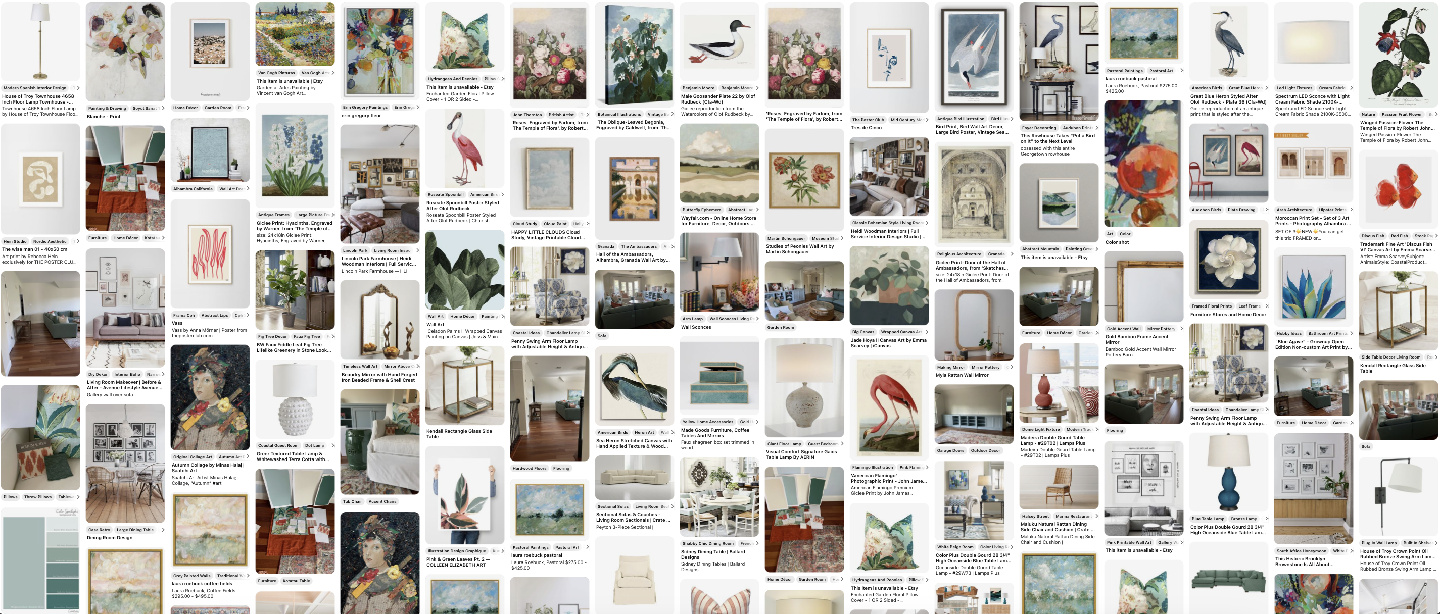
As I mentioned, she loves to decorate and she sent us an extensive inspiration board:
She knew she wanted a gallery wall so she was ahead of the game saving plenty of art ideas to work with the colour palette and look she wanted. She’s also not afraid of colour!
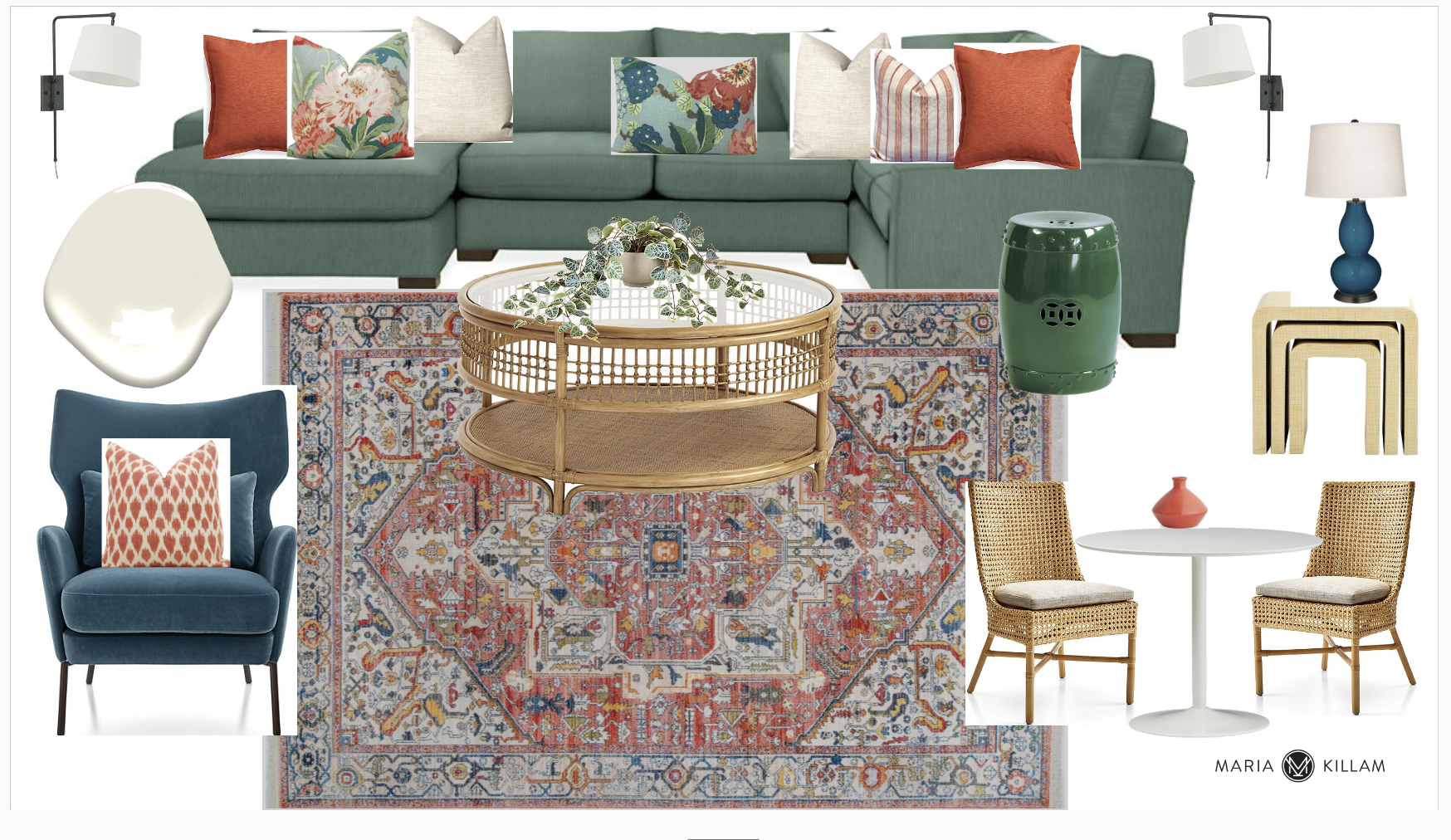
Living Room Mood Board
We gave her three options and this is the one she chose:
A pretty jade green sectional with teal and orange red accents. The orange accents really enliven the palette and also tie in with the red Brazilian cherry floors which are the only fixed element in the room.
The rattan pieces and garden stool create the garden room vibe she wanted.
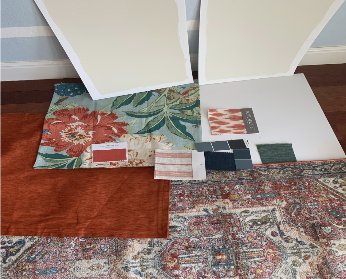
Testing your paint colours
She tested all the fabrics and colours with the rug as instructed.
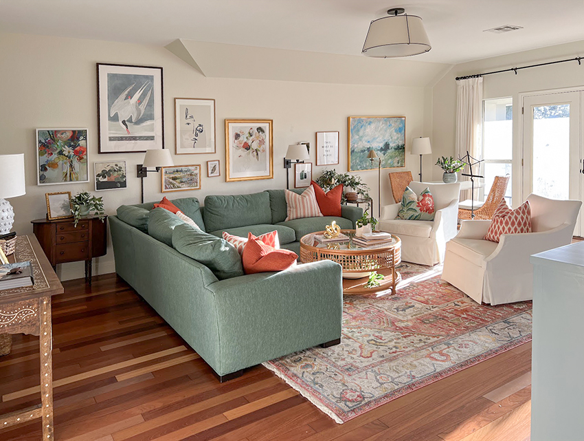
And here’s how it turned out!
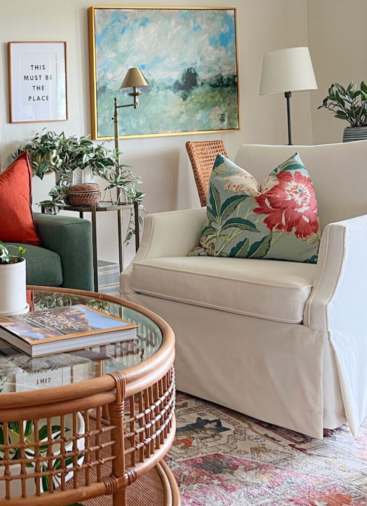
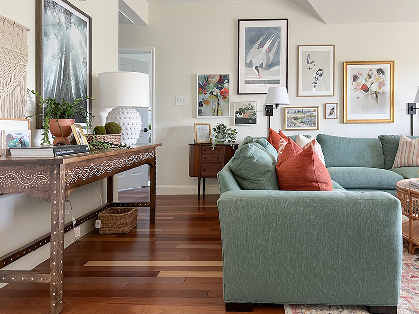
Now it’s so full of life and joy! The colours are beautiful. You can see how much love she put into her fabulous gallery wall!
She opted for white slipcovered accent chairs which look perfect.
And she’s done some wonderful styling in here too! There is no shortage of mood lighting with lamps. She even installed the swing arm sconces behind the sectional. If you have a sectional against a wall you simply must have a pair!
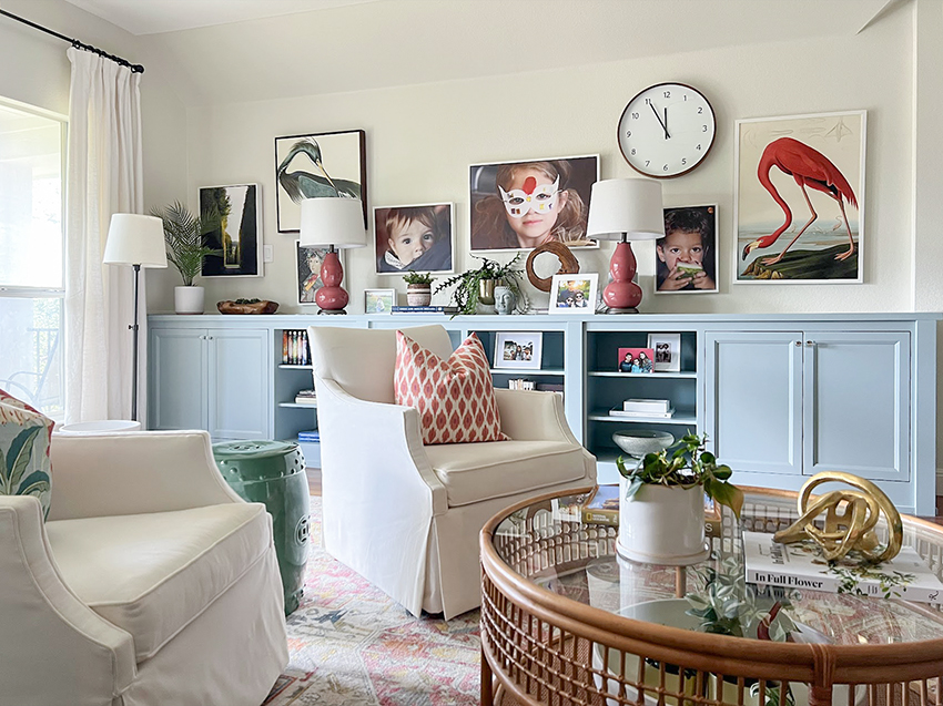
And here’s the other side of the room with the built in storage. She’s done a lovely job of styling this too. And really amazing how she incorporated pictures of the kids so seamlessly with the art. The red gourd lamps do a great job of picking up the red tones in the area rug and it’s repeated again in the art.
If you have a room that’s ready for a fabulous transformation, check out my Get Me Started eDesign decorating package here.
Learn how to create your very own beautiful mood boards to decorate any room in your home with my How to Create Mood Boards self guided course here.
Related Posts
The Style of Your Home > Your Design Style
What Colour Works with Orange Wood?
What is the Best Colour for Living Room Furniture? An eDesign Before and After










Wow – that’s amazing! Where did she get that sectional???
I’ll be honest, I usually don’t like gallery walls, they’re overstimulating to me.
But she did wonderfully and I really like hers.
What a pretty room. And it seemed to me that it was all because of the colours used – but you don’t really realize it’s the colours that make it. Perhaps as there’s a lot going on, I don’t know. I would love to have that very room!
Absolutely stunning! What a great example of an edesign package finished room❤️. Procrastination be gone.
Wow. What a marvelous makeover! I love all the mixtures of colors to brighten it up. The gallery wall is very very nice.
I think this is my favorite make-over yet. Wowza! Love it love it love it.
I love this room! What great selections and it has such a pretty and cozy vibe- very inviting.
Question: Right off the bat, looking at the large blue and green art piece the only way I see that it relates is the green sofa. So, does the large blue and green artwork in this room work because blue is the accent color or because of the green sofa?
To me, it’s balancing the green sofa, the blue built in cabinets, and the green floral pillow on the armchair. There’s also a green garden stool between the two armchairs
Gorgeous! I love every detail of this room. The color scheme is totally my jam, and I’d love to have this room in my home. Brava to your client for bringing her vision to life with your help, Maria!
Now this is a JOYFUL JOYFUL room!
Thanks to Maria for making it so easy! Every person who comes into this room adores it including us. My kids lie on the couch with their electronics and I get so much joy just walking up the stairs and being greeted by this room. A couple of things I wanted to note. Maria gives multiple options and they can generally be mixed a little. So the furniture options that don’t match her mood board actually came from a different option. I just made sure fabrics were adjusted for this board. I also know that I have to see it in place to know whether it works or not (which is why I don’t do this on my own). So I always take the time to collect all the samples together. Sometimes the online colors aren’t accurate and Maria is always willing to correct for that. For the gallery walls, I choose art I like but I also create a mood board (I did take Maria’s online coarse for online shopping) to start. This helps so that I don’t end up with extra art I don’t use. I had two extra pieces from this room and I just hung them somewhere else in the house. Then I hang and move till I get something I like. Often the arrangement I I thought I would hang does not actually end up the final product. So yes, I end up with a lot of nail holes in the walls.
Like Tuesday’s kitchen post mentions. it does take faith to buy the furniture when there are some items you think, I would never have chosen that on my own. But I have come to learn from Maria that you have to focus on the whole effect rather than a single item. Those pieces just grow on you if you let them anyway. And after working with Maria so long I have first hand experience that the faith is well founded and so becomes easier.
Stunning – where did you get the sofa?
The sofa is the Room and Board Metro I think. I don’t buy everything at once usually. First, just the things that are on sale, might disappear or are critical to tying the room together, like the rug. Since the sofa was from a really reputable source and high quality and I knew I would have it for a decade or more, I “saved up” for a few months before ordering it. Of course, it took a few months to arrive as well but I don’t mind the delay. I enjoy the process of seeing each new addition. Having the plan from Maria keeps me really disciplined to not buy other stuff I like.
Absolutely gorgeous! Can you share where you got the rug?
Thank you so much for chiming in, Patience! Your new room is gorgeous 🙂 You are certainly a living, breathing testament to Maria’s skills and her online products. AND, I can tell that you have cultivated a keen decorating eye as well. It’s amazing to have a space that sparks joy – well done to all involved!
It looks like you went to the home and performed magic. Congratulations to the client who knew what she wanted, just needed that coordination that is not a strong suit for many of us.
Great job Patience! What walk paint colors did you decide between, and what tipped you over to the one you used?
Looks great! My next couch will be a color!
What was her wall colour? It’s perfection!
With such a busy floor pattern, it would be easy to make mistakes decorating but Maria and her team did a great job integrating all the colors, with wonderful input from the client. As the client clearly loves blue (color of the original walls) it was nice to see the built-in shelving painted blue. An inspiring and practical room for the family.
Such a bra room!!
I’m curious about the built in cabinets- were they already in the room or did you have them built? What color are they painted?
And the rug – can you share please?
Oops! That should read – what a beautiful room!
I love this! And that sofa is absolute fire! Like others I would also love to know the wall color you used.
This is is welcoming, happy and tasteful. I am just curious though, this room is not kids orientated. Did the client change her mind?
Why not for kids? It’s a perfect room for the whole family to enjoy.
This is so gorgeous and relaxing! Love the colors and gallery wall.
This transformation is so inspiring! As an interior designer, I love seeing how a space can go from being underutilized to becoming a functional, beautiful room that truly meets the needs of the family. Patience’s upstairs living room now feels so warm and welcoming with the gallery wall and the addition of storage—it really brings everything together. Creating a workspace for the kids was such a smart idea too! It’s amazing how just a few thoughtful changes can completely change the energy of a room. Great job!