A neutral sofa in a neutral living room often needs colour to bring it to life. But, how do you know which colour to decorate with your existing neutral decor? Here are 7 easy ways to add colour to your neutral living room – plus my favourite place to start your colour palette!
Lately, I’ve been thinking a lot about grey sofas. Because even though the trend has moved from grey to black, white & cognac, people are still hanging onto grey.
If I were to ask YOU which neutral was THE MOST neutral. You’d probably say grey right? Well, would you?
Let me know in the comments if my assertion is correct? I could be flat out wrong…
But I think it’s also the reason why, in the world of commercial interiors, grey is a constant neutral. It doesn’t seem to go in and out there. Haven’t offices had grey-panelled walls forever?
So first, I’m not saying ya’ll need to jump onto the next trend. Not at all.
But when the brown trend came to an end, homeowners quickly moved on to grey. Not that this is what should have happened. I’m just reporting here.
Read more: Why a Colourful Sofa is as Timeless as Subway Tile
Anyway, what I’ve been percolating on lately, is that too many people overthink decorating with colour.
And maybe it’s because you think if you’re going to have a colourful room, it has to look something like this:
That is, a room with colour has to be decorated with complicated patterns and perfectly chosen colour palettes. This kind of look takes expert decorating skills.
But I think it’s a common problem to be unsure about where to begin adding COLOUR. I talked about this on a live IGTV recently when I talked about, “What if I Don’t Like the Current Trendy Neutral’ here.

How to add colour to your neutral living room
And when you don’t know where to begin, you might too quickly end up with too much neutral.
Too much grey or too much beige. And nowadays, too much black or too much white.
It’s all too common to create a neutral base, say a neutral paint colour and sofa for example, and have no idea when to take the leap into some colour to bring it all to life. So you just continue to choose everything in grey (or black or beige…), the area rug, the drapes, and eventually the pillows and art too.
There is never a lack of decor items available in the trendy neutral colour of the moment, so it’s just easier right?
1 | Avoid too much of the same neutral
As an aside, can I just say that I think grey drapes should mostly be banished? I just do not see the point in continuing the look of a grey sofa, on your windows. And just in case you’re about to hang some drapes right now? Read this post first to get your measurements right.
When in doubt, choose white curtains/drapes to match your trim.
Anyway, if you get stuck on the everything-the-same-neutral rails, you end up with a room that looks at best, like some version of a drab showroom display like this below.
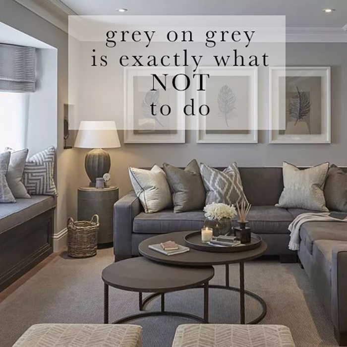
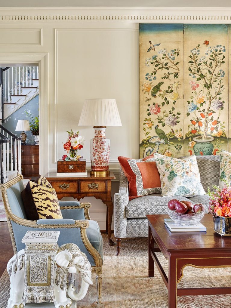
If you have. a charcoal sofa and grey walls, I’m saying DON’T also get a grey area rug, toss pillows and window coverings. Too much grey can be sad. And colour is simply happier.
It’s good to know AT WHAT POINT TO SHIFT INTO COLOUR and it’s my goal to help you add more into your life!
It doesn’t have to be complicated!
It’s as simple as this: pick an area rug with a COLOUR and repeat it.
(Already have wall to wall carpet? No problem, layer an area rug over it.)
2 | Start your decorating colour palette with a rug
And by the way, the reason the rug is important is that it’s a LARGE dose of colour. It’s a common mistake, when introducing an accent colour into your room, not to take it far enough. Just a pair of red toss pillows in an otherwise grey room for example is not going to look convincing.
For an accent colour to be successful, the rule of thumb is to introduce it in LARGE, MEDIUM and SMALL. doses. An area rug takes care of the large dose of colour, really making it look intentional.
This is the reason too that you want to look for a rug with a decent proportion (like half or more) of the colour. It’s not about getting out the magnifying glass to find the colour you want to accessorize within your rug. Choose the most dominant colour in the rug instead.
3 | Adding colour to a grey sofa
So if you have a grey or charcoal sofa, choose a rug with a lively colour and REPEAT IT.
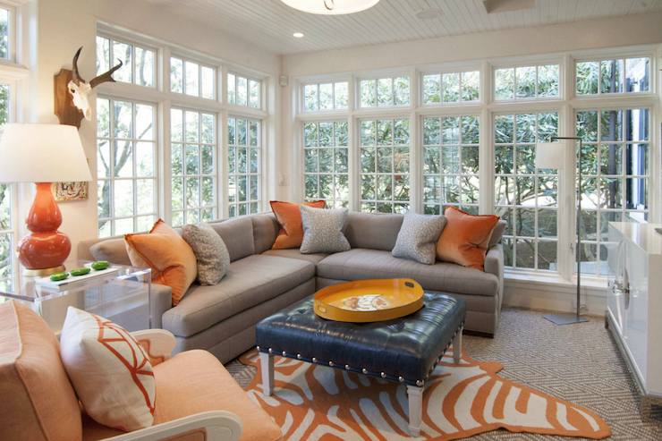
If this violet grey sofa was sitting directly on the grey patterned wall to wall carpet without any colour? It would not be an inviting look. It would be no look at all.
The minute they threw down this fun faux zebra rug with a vibrant warm orange and sprinkled the colour around liberally in the pillows, tray, lamp, and accent chair, we are drawn in.
See? It doesn’t have to be complicated. Choose ONE colour and put it on repeat. It usually doesn’t hurt to toss in some white for fresh air in most rooms too.
4 | Adding colour to a cream, natural or light beige sofa
Often, a cream, light beige or “natural” sofa opens up even more options for fresher colour. But this pale pink beige sofa below would look pretty drab sitting in a white room without the addition of colour. A colourful area rug instantly brings this room to life.
Again, simply repeat the colour (and if you have a multicoloured rug, you can repeat more than one if you’re feeling adventurous) in accessories and toss pillows and ta-da! You have a room worth living in.
Caitlin Wilson Design is one of my favourite sources for pretty area rugs in fresh colours.
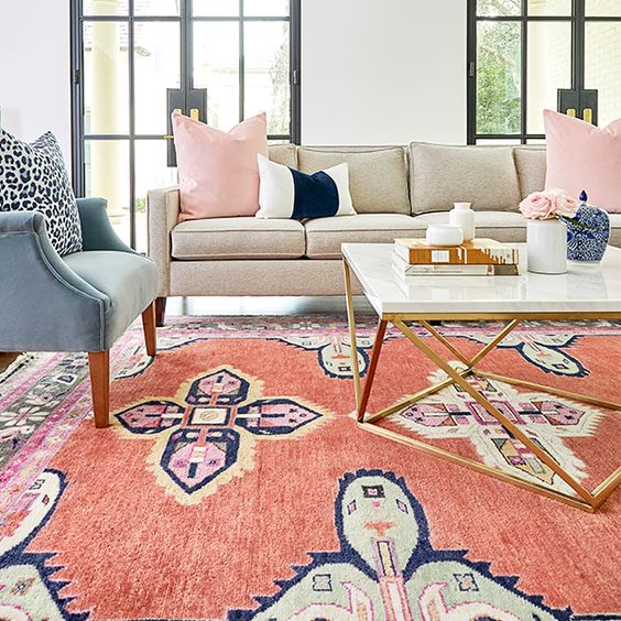
In both this example, and the grey and orange example above, they have taken it to the next level with the addition of an accent chair in a colour. This is a bold step that I absolutely encourage! And you don’t have to guess which colour it should be, just pull it directly from the rug!
Creating mood boards before you “add to cart” can be so empowering. Find out more in my online training.
5 | Adding colour to a brown sofa
Got a room with lots of brown and wood? Consider a rich blue, teal or green accent. Shop for a rug in the colour you want to decorate with first.
A great tip I include in my new Shop Online with Colour Confidence course is to expand your colour vocabulary for more effective online sourcing. Is it a periwinkle? Or Indigo? Grass, moss, olive or kelly green? It’s a great way to narrow down your search and find what you’re looking for.
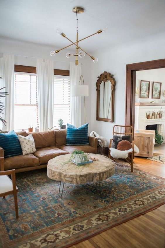
Even repeating the colour just once, as they’ve done with the teal blue pillows here, works in a pinch. A nice trick is to find a rug that has the grey or brown or beige of your sofa in it as well as the saturated accent colour you are introducing.
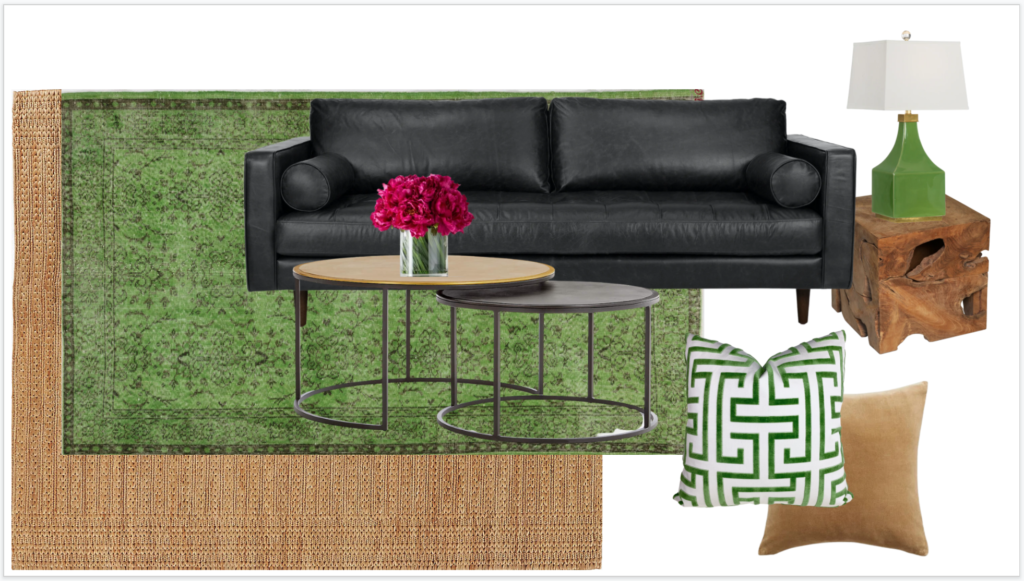
6 | Adding colour to a black sofa
Black is especially bossy and heavy, making it even more challenging to see the move needed to get into some colour in your room. So much so that I couldn’t find a single good example of a pretty room with a black sofa and some colour. An image search for black sofa living rooms is pretty bleak.
So I made up a quick mood board to show you what I would do.
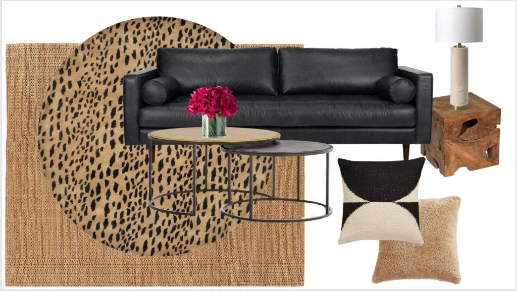
Round Leopard Rug | Jute Rug | Nested Coffee Tables | Sofa | Lamp | Wood End Table | Shearling Pillow | Black and Cream Pillow
I talk about black a lot. It’s trending, and while a little is always a good thing, there is a tendency to overdo the trending neutral and this is particularly dangerous with black. Because it’s SO heavy. The best way to approach a black sofa is to go glam.
However, if you want a casual or rustic vibe, skip the black sofa. It will look best with a bit of warm contrast, brass and richer wood tones. To bring a black sofa to life there is nothing like a hit of leopard print.
Cognac, light beige, cream and white are also excellent at softening the palette. Black and grey or black and white immediately give you the stark minimal look. This look is not only really tricky to pull off well, but it also belongs mostly in well-composed photographs and not so much in real life. Again, my opinion.
Rich jewel tones also work really well for adding colour to a black sofa. Deep pink, rusty reds, and deep, leafy greens wake up a room with too much black.
Green Overdyed Rug | Jute Rug | Nested Coffee Tables | Sofa | Lamp | Wood End Table | Camel Pillow | Green and White Pillow
But remember, adding colour doesn’t have to be a pop of a saturated hue. In the case of black or charcoal, or even much too much white, if you want a neutral look, you can pull in warm woods, beige and cognac for balance.
Just watch those five undertones of beige when you get into the world of mixing warm beige and brown neutrals. Do you know what they are?
7 | Adding colour to a beige sofa
And the reverse is also true. Have too much beige in your world? Add some high contrast black, glam leopard and lots of cream or white.
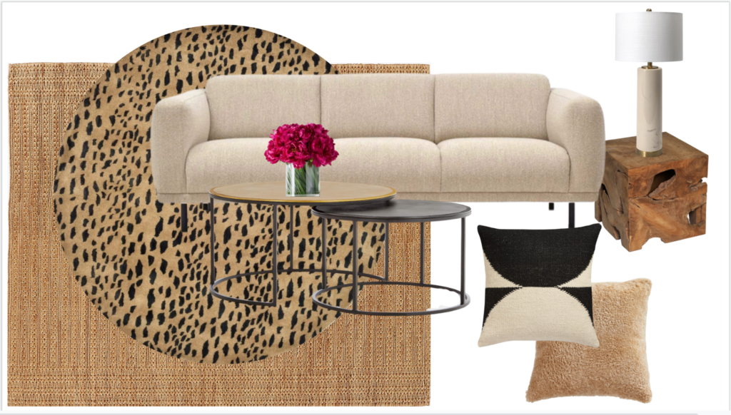
Round Leopard Rug | Jute Rug | Nested Coffee Tables | Sofa | Lamp | Wood End Table | Shearling Pillow | Black and Cream Pillow
And if you want brighter colour with a pink beige sofa? The combination of blue and white is a sure thing for freshening up pink beige sofas.
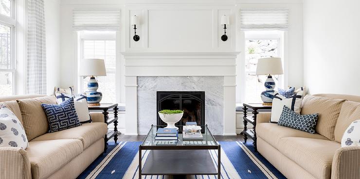
I would paint the walls in this room above a pretty complex cream like SW 6105 Divine White to further tie them in. The white walls in this room make it feel a bit bottom heavy. But it’s a great example of simple blue accents repeated in the area rug.
A pretty and colourful living room starts with a rug
So there you go. If you’re not sure where to start adding colour to your room, choose a pretty, colourful area rug and work from there. Nothing wrong with a simple formula! Gotta learn the rules to break them well.
You can also do this to change up a tired colour scheme. Take the rug, pillows and accents out of your room, stripping it down to just the walls and sofa, for example. Then reimagine it with a pretty new area rug and accessories to match. Complete transformation!
Worried about shopping online? Ordering area rugs online can be a real pain point. My Shop Online with Colour Confidence course has you covered! With my best tips for shopping for all things colour and decor online, including the best way to shop for area rugs!
“I loved this course. I had never thought of putting a mood board together this way until Maria outlined it in this course. It makes the whole process less of a gamble. The added bonuses of the checklist and online sources save time and money. I feel far more prepared to shop successfully on line. Yeah!!! You are so generous with all you have learned in your design business. This was well worth the money!” – Catherine M.
Learn how to choose the right colours for everything in your home in one of my virtual Specify Colour with Confidence events.
Related posts:
How NOT to Decorate Around a Dark, Neutral Sofa
How to Transform a Charcoal Sofa with Colour; Before & After


Just curious as to why a sofa has to be a solid color?
Why can’t it be stripes or floral? A solid color sofa with solid color chairs with solid color drapes and solid color throw pillows is just kinda boring to me. And I am not a fan of rugs on rugs, it is a trip hazard and just looks like the original rug was a mistake.
It absolutely does not need to be a solid. However, this post is written to the homeowner who has a grey-on-grey-, white-on-white, black-on-black, or brown-on-brown room and is afraid of colour. Look past all the tripping hazards and just repeat the colour on the floor, pillows and drapes, that’s my message here!
Thanks for your comment! Maria
I quite like grey – indeed grey blue and blue grey have been my favorite colors most of my life – but I think the most neutral neutral is beige. It seems to pair more easily with other colors.
An anecdote to share – the flagship Restoration Hardware in NYC is near my apartment, so I pass it frequently while walking my dogs. I’m surprised at how grey on grey on grey the store is. It definitely allows their brass and crystal light fixtures to stand out, but I am so ready to move on from that look.
That’s odd. As far as I know, down here in the boonies (HouTX).. everyone is pretty much over gray..
After Hurricane Harvey, my kids had to rebuild their whole house. The contractors even talked them into gray ceilings..and this was not a light gray! They have finally moved and are SO over gray!
Restoration Hardware gives me cloudy day vibes.
Honestly, I kind of think (and it is my experience) that the best neutral coloured sofa is cream. I have cream slipcovered sofas, which are washable; I have dogs and kids. You can pair other colours with it pretty safely. I have found that it is the most versatile and timeless, and I haven’t grown tired of it at all.
I really love a wild throw blanket combined with a solid color sofa. I have a navy sofa and I keep a leopard print throw blanket across the very top of it or casually draped over one arm. I believe animal prints can mix with just about anything. As for pink beige, if you made me choose between a pink beige sofa and a gray one, I think I would choose pink beige. In the end, it’s the accessorizing that makes the room even if you have the plainest of furniture. Hang the bright, colorful pictures that your children drew in nice frames and pull the colors from those for other accents. At the end of the day, I can look at pretty pictures in the decorating magazines, but they aren’t meant for me. What really makes a home is translating some of those design ideas with the things I have and love. And I think that’s what Maria is really talking about.
Cream might be the most versatile neutral, but my family always seems to get stains on things that bleach or specialized spot removers can’t remove. Although grey is NOT my favorite neutral, I think it might be the most versatile, LIVABLE neutral to mask some of the effects of, well, living.
That being said, however, I’m a firm believer in Maria’s idea of a colored sofa as a neutral. Well, not necessarily as a neutral, but as timeless. I’ve had a green couch for the last 15 years and when my dog and son are finally mature enough, I will be replacing it with another green sofa. I want my house to feel like a home, and placing a big block of color that doesn’t feel like me (black, grey, cognac, etc) does not make me happy. But if I had to choose a neutral, I’d want a comfy brown leather couch.
IMO, the phrase “trendy neutral” is an oxymoron. A neutral is a neutral. It’s timeless. Choose the one you love and move on from there.
When you’ve watched the overuse of trends for more than 20 years, the word ‘trendy neutral’ will mean something to you 🙂 Maria
To me the most neutral neutral is off-white or cream. So many more directions you can go with it v. gray.
The image with the faux animal rug and the orange pillows isn’t making it for me. All the orange is the same saturation and looks so cookie cutter. Orange has all different shades and tones. If a designer did this, she needs your course on color. Two tone violet gray and orange, mmm no. White doesn’t rescue this.
Look past all that to just the orange + grey. I’m trying to make choosing colour easier by showing this image, not to be confused with that everyone needs to run out and copy it. Take your grey on grey on grey living room and choose a colour and repeat it. That’s what I’m talking about. Hope that makes it more clear! Thanks for your comment Diana! Maria
Great post Maria!! It is hard to believe but I still see flippers making everything gray! Yuck! I do think that gray is more “livable” but after the overload of ALL gray homes I think everyone is sick of it!! I agree a color is better because it can’t be “dated”.
When I think of a neutral sofa, I think of cream/beige rather than grey. And for years, I would buy something darker to better hide the inevitable “accents” left by kids and pets. 🙂
Thank you for another very helpful post, Maria . I’d love it if you would expand on this sentence: “When in doubt, choose white curtain/drapes to match your trim.” I’m about to choose window coverings for my entire main floor and upper floor which is more than a little daunting.
I have read your blog for many years Maria and we have a lovely pale blue sofa which I adore. Had a listened to the sales person it would have been charcoal and I would be having a much harder time making our house feel happy and light. Thank you! xo
Blue sofas for the win! I love a blue sofa every time.
I think cream, light beige is the most versatile neutral colour. I just do not like grey – so drab and depressing .
I love the idea of a colourful rug – if you can find one in the right colour -and if it’s not on on trend that is very difficult. I would have loved a rug with. a yellowgreen – to go with my ivory sofa and. green/ ivory chair. Have never found one – or pillows. Ended up painting my walls the green. Looking now for neutral rug. Will keep up the search for the pillows…
My vote is for grey as the most NEUTRAL color because it has the fewest bossy undertones. You don’t really have the problem of yellow-undertoned greys actually appearing yellow! The beige family can drive you CRAZY.
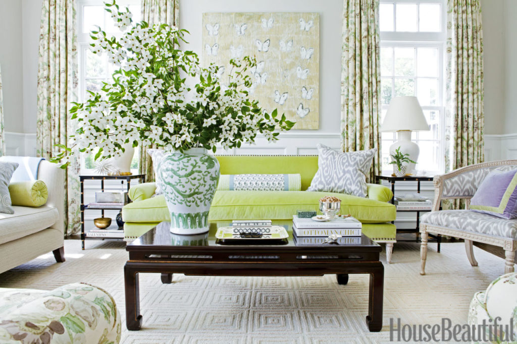
That room with the green sofa is so cheerfully gorgeous!
And I think that the green sofa room is nowhere near as difficult as the floral room is. Encouraging for those who are trying to get their toes in.
Such a great post Maria. I’m loving all these colorful rooms, especially the first picture. I think there’s nothing more drab than grey on grey on grey (same goes for overdone beige) even though many of these rooms are published in home decor magazines. Having a place to start, like a rug, should take the guess work and fear out of adding accent color. To me the most versatile neutral is a light cream. However it’s tough to argue that a dark grey sofa will not show stains nearly as much. And, as you show us, you can add color and life to these sofas. My fave color for a non-neutral sofa is Cobalt.
Excellent post! Thank you.
Interesting article in WSJ today…RE: Maria’s recommendation of starting with a rug….a big technology assist with online rug buying now available
Posting article as info…..
Meet Your New Interior Designer: Your Phone
Many retailers—selling furniture, rugs, luxury stoves—have digital tools that let you customize a product or ‘drop’ it into a photo of your room.
SWITCHCRAFT Software on retail sites allow you to swap products such as carpets in and out a space via an uploaded photo or your smart phone’s viewfinder.
ILLUSTRATION: JOHN W. TOMAC
By Michelle Slatalla
Sept. 21, 2021 1:45 pm ET
I AM A RUG addict. The way some people like to test-drive cars, I like to roll out antique Tabrīz carpets to see how their colors and patterns might completely transform the living room…or the family room…or even the kitchen.
This once seemed like a harmless hobby, when we had lots of empty floors and very little furniture. But now it’s attracting unfavorable notice.
“You have a very big rug problem,” said my best friend, Stephanie, an interior designer who absolutely refuses to look at rugs with me, the other day. “You have to stop working poor Richard to death.”
Richard runs the rug store in town, and this past week he delivered two 50-pound rugs. I wanted to try them in the dining room.
ls.
Lucky for him, he only had to drop them in the corner of the room. Then my husband had to move the furniture so I could try out these rugs. Which I didn’t want in the end. Because there are so many rugs to try.
Stephanie, who happened to stop by after the rugs were rolled back up and waiting for Richard to retrieve them, observed, “People are not going to put up with this much longer.”
Maybe they won’t have to. I recently discovered a miracle cure for my problem: room previewer tools on retailers’ websites, which let you see exactly how a rug—or sofa or bed—will look in your house without having to move furniture around.
These digital tools are becoming popular on retail websites. Some use augmented reality, some use 3-D rendering technologies and others just seem to be magic.
My favorite kind of tool allows me to upload a photo of my room. Then the tool inserts the rug (or furniture) I’m pondering into the image, perfectly scaled to fit my space.
After I spent the better part of an afternoon trying this out at Rugs Direct, CB2 and A-Street Prints (which sells wallpaper), I had an epiphany: Finally, the internet works!
The days of software that made you wait for minutes for a crude rendering to appear (or crashed your computer before the task was completed) are over. Processing power has gotten so fast, even on our phones, that we have the bandwidth to move photos across the internet in seconds, while a software tool does super-complicated math simultaneously and inserts a product from a retailer’s image library into that image and makes the mash-up appear on-screen.
Or something like that. For technical details, I phoned Pawel Rajszel, CEO of Leap Tools, creator of the Roomvo tool on the Rugs Direct site.
“I’m looking at a photo online of my dining room with a very attractive rug under the table. I’m wondering how this is possible,” I said.
“I can’t tell you our secrets, but I can tell you we developed a proprietary technology that tries to adjust for all kinds of factors,” said Mr. Rajszel, who has been refining his room previewer tool since its launch in 2017. “You might notice there’s a shadow on the rug from the light coming into the room,” he said.
“That’s eerie,” I said. What’s next? Visualizing wine spills?
The Rug Company’s ‘Build Your Own’ tool lets you create your own iteration of carpets, including Kelly Wearstler’s wool and silk ‘Channels’ design (shown), from a palette of 120 colors.
Ben Houston, chief technology officer of Threekit, a Chicago company with a room previewer tool called Virtual Photographer, tells me that in the future, tools may allow a designer and shopper to simultaneously manipulate an uploaded image and add or move multiple pieces of furniture in the photo. “Someone from the store will be able to join you ‘in’ your room and give you shopping advice, like get a bigger rug and move the couch over there.”
For a second, I imagined doing this with Stephanie. If she weren’t so mean.
Threekit’s tool is sort of the opposite of Roomvo’s. You use your phone to grab an image of the furniture you’re considering from a retailer’s website. Then you can place the furniture in any room simply by looking through your viewfinder.
Mr. Houston directed me to Crate & Barrel, which has embedded the Threekit tool on some product pages. I clicked on “View in Room” to see how a full-size Jenny Lind bed would look in my guest room.
“Wow, that’s crazy, it adjusted to the right size in the space,” I told him, “but to be honest, it’s sort of hovering in the air, like the flying bed in ‘Bedknobs and Broomsticks’.”
“We’re working on that,” he said.
Other tools called configurators allow online shoppers to customize products on-screen, changing color combinations, patterns or shapes.
Retailers who sell high-end custom home furnishing products—like the Rug Company and L’Atelier Paris Haute Design (which sells luxury cooking ranges)—say the configurators have increased sales and cut down on returns.
At L’Atelier Paris, stoves come in 220 colors, and prices range from $13,000 to over $65,000 (“if you add a hood,” said Ricardo Moraes, the company’s CEO) and can be fit with warming drawers, extra burners and other features.
“The days of the professional designer doing everything for the customer are over—people want to configure luxury ranges the way you can go online and configure a car before you buy,” said Mr. Moraes.
At the Rug Company, a configurator let me create custom versions of rugs by Kelly Wearstler, Paul Smith and Diane von Furstenburg. I changed sizes, shapes, patterns and ground color using a palette of 120 colors—which raised a question.
“Computers are notoriously bad at accurately rendering colors. How do I know what my rug will really look like?” I asked James Seuss, the company’s chief executive officer.
“After you create the design, our design team will send you samples of the exact yarns that we will use to make it,” Mr. Seuss said.
I asked him if I could visualize the custom rug in my room. Not yet, he said. For now, there is no room previewer tool on the site.
“If you send our design team a photo, they will insert the rug into it,” he said.
That seemed so primitive—until I looked at my poor husband schlepping actual rugs to the trunk of the car to be returned to Richard.
Don’t copy paste entire articles. Not only is it annoying but in America you (blogger) get SUED and there are lawyers trolling around the internet looking for this infractions. Post the title, the one interesting paragraph and a link.
The James Farmer room is so dreamy. I’ll take 2!
I am very attuned to neutrals because I love above all the range of colors of natural fibers. Wood too, unstained.
When you look at natural fiber minus the dyes, minus the optic whiteners, you have a gorgeous palette of neutrals. The range of colors of sheep and goats, of camels, silk (there are several species of moths that make different kinds and textures of silk), cotton (again there are colors that appear in nature), linen. Adding dyed vibrant color in a rug, in pillows, accessories as you have done makes excellent sense to me. Too much strong color/pattern is overwhelming and tiring to me.
It’s hard for me to choose color minus texture. Really hard on a screen. I learned so much from the White Is Complicated book, choosing finishes for a spec house we built in Montana when the gray trend was at its peak. During that process, I placed an antler from my husband’s collection in in a vignette with potential paint color, carpet, wood floor, cabinetry. Photographed it in different lights, stared at it with one eye shut 🙂 I wanted that antler, its grays, creams, browns to set the tone and feel.
We have a few animals and animal pelts around. I marvel at the range of grays and creams on our long haired cat. He would be an excellent takeoff for a color palette. As would the winter white with gray/brown caribou hide on the back of my sofa.
There’s no lack of intense colors in my world but smaller doses: Berries, insects, mushrooms, flowers, birds, lichens, aspen leaves, trout.
Maria – thanks for all the tips .
I struggle with color it definitely takes me out if my comfort zone .
Might not ever be for me .
But I can appreciate a design well done .
Thanks
Yep, I am stuck with my charcoal gray sofas and armchairs. I just can’t part with them because they are only three years old and in good condition. Or maybe I just don’t want to fight that fight with the hubby. So instead, I added a ton of color in rugs, throw pillows, artwork, and vignettes. Also, when we painted the walls in the open space in our home, the painter was trying to convince me to paint it white or gray. Instead, I opted for SW comfort gray which is more of a blue/green gray than a true gray and I love it. In fact, the entire interior of my house is painted in shades of blue and green. It’s definitely not boring 🙂
This is a very helpful article. I wish I had some of the lighter color sofas you picture. The leather sofa and oversized chair in my family room are a very practical dark brown sitting on beige carpet—not the medium brown or black like your examples. So far all I’ve done is add cream pillows and a throw to lighten it up. What colors would work for those of us with dark brown sofas?
Have you tried fresh leafy green or a fresher blue with the dark brown & cream ? Then a few smaller pops of orange/pink/yellow? Try a mood board! What do you think? I am in a similar boat.
Maria, you gave me the courage to choose a vibrant yellow/green sectional sofa for my bonus room that has deep navy walls and white wanescoting. I found a ginormous navy and white rug, some accent pillows, throw blanket and accessories/art with goldish colors to match the couch to tie everything in. The room is absolutely fabulous now!
Thank you!!
Wow, I just love that first picture! I would love to do a color scheme with those colors, but I’m not sure it would work with my trim & tile. I’ve scoured your posts, reading all of your advice, making a color wheel, and searching through pictures for inspiration. What I really want for a paint color is a cream or off-white, but I have amber pine trim & beige tile with a lot of beiges – pink, green, taupe & peach. I’ve about given up & decided to go with a pale green of some sort, but my big question that I want to know either way is – Is a cream possible with those undertones? (My living room is bare, so my colors can go in any direction.) Since my trim & flooring doesn’t have yellow undertone, I don’t think cream would work, but I would feel so much more confident if I heard it straight from you 🙂
I forgot to include an important detail – a cream or off-white that doesn’t have an orange undertone. I feel like I’m drowning in peach/orange. It’s making my whole space so warm and not in a good way.
Hi, our house is painted in Sherwin Williams Grecian Ivory. It looked pale green when it was first sprayed on and I though oh what have I done. As it dried it became rather like a very light khaki with green undertones. I’ve had it 8 years and I still like it. I have warm reddish wood floors, natural cherry cabinets, pretty warm brown tile. White trim. I like the combo. It doesn’t play well with the bathroom tile which is a definite pink beige picked out in a hurry. I’ll paint the bathrooms sometime.
To me the best neutrals for a sofa are cream, beige, white or brown.
My favourite room above is in the second photo – it’s so fresh, cheerful yet calm that I would not tire of it. Sorry Maria, there are two things that I dislike in decor: white curtains and solid strong coloured lamps. You’ll notice that neither of those are in that room. In my view, off-white is the most neutral; although it may not be the most practical. Off-white is so versatile that almost any colour will go with it.
Rug merchants have been trying to convince us for decades that we should always start decorating a room with a rug because finding the right rug for a room that’s already decorated is 10 times more challenging than finding a sofa and chairs to match a rug. I can attest to that because I’ve made that error even though I’ve known about “start with the rug”. My problem is that I’m attracted to expensive rugs and there wouldn’t be any funds left to finish decorating the room. 🥲
Maria, may I make a suggestion? It would be nice to have a ‘thumbs up’ symbol at the end of each comment. I find that I often agree with someone’s comment but don’t want to repeat it so as not to be repetitive.
Renee, so true! It would also seem that you can find oodles of rugs that have the current style brown tones of cognac and darker rust, but espresso brown is not and when I do find a rug with espresso brown in it, it’s a hefty price! I always say I’ve got champagne taste on a beer bottle budget!
Vote for Gray is my neutral!! Summer my pillows , & throw are Citrine Green , Fall /Winter I use navy pillows and 2 leopard lumbar on two chairs. At Christmas I use Furry Pillows and Throws. We have most colors from our oil paintings 🖼 which my husband has collected. Very soothing room. Long Gray drape panels.
Love reading this post ! We have had this dark Gray for 5 years.
As someone who is currently struggling with a dark warm-toned grey sofa (which I love and want to keep) I would have loved to see an inspiration photo rather than the what not to do photo. I currently have a grey wall to wall carpet (which I can’t afford to replace at the moment), and white walls. I’ve used colour in the cushions and curtains and artwork but it’s still looking a bit bleh.
I tried an area rug but it wasn’t successful because it kept creeping on the carpet 🤔
Maria I’ve had this burning question on my mind for months now regarding what you’re addressing in this post- My questing is can you take another color that isn’t in your area rug OR your sofa and incorporate it in with throw pillows, blankets, lamps, etc… or will you end up with a disconnected looking space? I have an area rug that’s described as navy and cream but the cream in it looks more like a beige background with navy (the second largest color in the rug and the accent color I’m using) along with shots of other different gray tones. I chose a lighter version of another darker green gray color in the rug (SW Agreeable Gray) to paint my walls because my granite is black but has green undertones as well and my kitchen, living, dining room is open concept. There is not a drop of espresso brown (my sofa color) in the rug. This has been bugging me and I’m not sure if I’m making the right choice using this rug because of it. PS I was thinking of painting some dining table chairs a deep emerald green as I think it looks better with black than navy.
You also nailed it when you talked about a black sofa not quite working in a casual or rustic space. Black sofas feel very glam to me, could never quite put my finger on it until you said it. I’ll always own an espresso brown leather couch because I have 2 dogs and a husband. I’m a perfectionist and I don’t want to yell at dogs or hubby for sitting on the couch lol!
I’m wondering the same! I just painted my sunroom walls Avalon (a VIP color–thanks for the tip, Maria!), and I’d like to do cornices in a yellow-green and white, sort of citron printed fabric. I have a lagoon-colored sofa (deep blue) on the way. Must the rug have citron green in it in order to pull together the room? I’m finding tons of teal print rugs, but not many with that yellow-green.
Neutrals are timeless. except pinky beige LOL.
Maria, Which off-white is in the first photo? It’s very pretty.
I recently tried to paint my kitchen stonington gray by Benjamin Moore. Oh MY WORD. it was not good. I learned I am not a cool color person, although I really like gray. I was surprised how it didn’t do anything for my cabinets that are warm, but the granite is more cool tones. Back to the drawing board.
Wonderful article as always.
Very helpful post with lots of solid advice.
Great article! Thank you!
Just don’t come near me with anything brown or beige. I’m allergic! I don’t mind cognac and
I don’t mind cream. I’m not a designer or decorator, just a regular citizen home owner who
is very interested in all things decorating.