When I originally sent my website designer the images of the rooms I had designed, she only liked ONE image. It had been taken by someone who had a professional camera. That’s when I decided to hire a professional, my friend and very talented photographer Anna Beaudry, to take photos of all the homes I planned to showcase in my website.
This image filled my screen and every morning I turned on my computer and there it was. Then one day I noticed something different about it. . . the white stripe on the chair had a wrinkle in it!
Upon closer inspection I realized she had just added it for the picture. Otherwise it would have been too much of a dark piece in the corner with all the contrasting drama of everything else in the room. Brilliant! So I did the same thing with my clients living room (second image)! I arrived with 3 yards of white fabric and suddenly magic happened!

 Maria Killam Colour & Design


 Bedrooms are a challenge to style because the bedding is usually the focal point of the room so it has to be absolutely perfect looking and preferably as un-wrinkled as possible! See the wrinkle in the orange pillow above on the sofa? It’s the only thing I see when I look at this image.If you just can’t get the bedding smooth, then the trick is to tousle it on purpose, like these beds from Ralph Lauren Home.


 A photographer once told me that the reason why people hire ‘perfect looking models’ for catalogues, magazines, etc, is because the clothes or beauty products then become more important than the model.
The model really does become the ‘hanger’ for the clothes being featured. If the model was too fat or too skinny or had a pimple on her nose, that’s what we would focus on. Its the same with photographing interiors.
The other, very important element of styling a room for a photo is flowers! Without them, a room can look quite unremarkable really.
 Okay, I can’t really say this is an un-remarkable room by Matthew Patrick Smythe without the flowers but you have to admit the addition of the simple branch of leaves in orange really adds a great pop of colour. It was where I got the idea for the arrangement I did below when I styled this living room I decorated in Richmond. I just cut them from a tree in my front yard on the day of the shoot!

Next are ‘tablescapes‘. I have learned the most about how to create them by reading blogs. A tablescape should consist of a mimimum of 3 items. Start with a vase of flowers, then stack some books. Books can also act as a pedestal to feature an object or elevate it like the above photo with the sculptured looking glass candle holders on top. Then add a 3rd object or a bunch like the silver and green balls on the tray above.
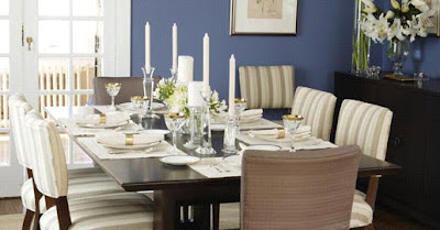
Finally, dining rooms. Now a dining room can be really boring without the table being set with dishes and flowers, especially if you don’t have drapes in the room. Dining rooms are second to kitchens with too many hard surfaces and the only way to bring in colour (besides the walls) and softness, is by using window treatments. Both of the following rooms, the first by Sarah Richardson, and the second for one of my clients in Lynn Valley don’t have drapery. But the images are still great because the tables have been dressed with dishes, place mats/napkins and flowers.

Styling kitchens can be the biggest challenge of all because you’re down to using toppers for the window above the sink to bring in colour and softness and then all you’re visually looking at is what’s on the counter tops. I find they can look really contrived unless they are done right (click here to see one I’ve styled).
Related post:


