Whenever reporters call me for a quote, it’s unfortunately, almost never to discuss the ground-breaking, revolutionary system I’ve created on Understanding Undertones™, it’s almost always to ask me about colour trends, (yawn), or to analyze the meaning of colour.
Colour trends of course, would be far less interesting if there was no discussion around the interpretation of the meaning behind the chosen colours.
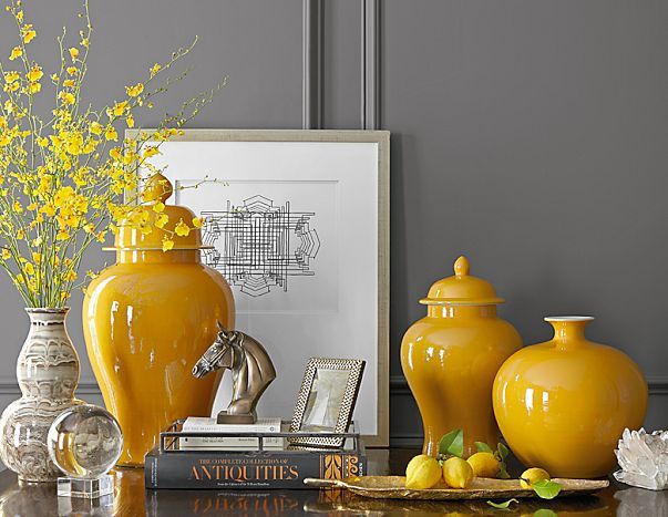
Whenever Pantone or a paint company announce their colour de jour, it’s always accompanied by the meaning of the aforementioned colour. In 2009 when yellow was the colour of the year, this was part of the press release announcing it:
{Click on images for source}
‘Mimosa, a warm, engaging yellow, as the color of the year for 2009. In a time of economic uncertainty and political change, optimism is paramount and no other color expresses hope and reassurance more than yellow.’
Then for 2010, this is what was said about Turquoise:
‘Turquoise, an inviting, luminous hue, as the color of the year for 2010. Combining the serene qualities of blue and the invigorating aspects of green, Turquoise evokes thoughts of soothing, tropical waters and a languorous, effective escape from the everyday troubles of the world, while at the same time restoring our sense of wellbeing.’
Then in 2011, Honeysuckle (raspberry) was announced:
“In times of stress, we need something to lift our spirits. Honeysuckle is a captivating, stimulating color that gets the adrenaline going – perfect to ward off the blues,” Leatrice Eiseman
And how should we interpret that? By looking back to the blue-green that was the colour of the year in 2010? That raspberry is now swooping in to replace ‘the blues’?
Whenever I hear a colour being announced along with the reason why, what’s missing for me is the series of events that lead up to that colour being chosen which would be far more interesting than, ‘It’s 2009 and we need a colour that signifies optimism‘, when that press release in 2009 could just as easily, in my opinion, have been interchanged by turquoise ‘Escape from everyday troubles’ from 2010 or honeysuckle ‘In times of stress we need something to lift our spirits’ from 2011.
Especially since whether the ‘colour of the year’ ends up actually being embraced by manufacturers or consumers seems to be completely hit or miss.
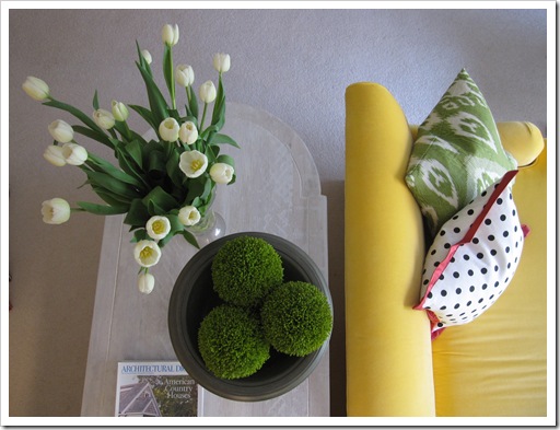
I searched high and low in 2009 and 2010 for accessories and fabrics in the exact shade of Mimosa because it was the colour of my new sofa (above), and there was nothing. I even wrote a post about that here in January 2011.
Turquoise for 2010 on the other hand was accurate. It was everywhere then and is still considered to be on-trend.
So what’s the point of all this you might be wondering? Is this my lame attempt to try to convince you that it’s all stories made up by smart marketers?
No.
I think the colours you choose to wear each day along with the colours you or your spouse choose to decorate your house with are incredibly meaningful and powerful.
And understanding why you are drawn to certain colours or even perhaps understanding why you dislike certain colours could, I believe, transform how you feel in your home every single day as well as make it much easier to commit to a specific colour scheme when choosing colours to decorate.
So that’s what I’m going to work on adding to my posts this year. And we’ll all learn, one interpretation at a time, how to incorporate the mysterious world of the meaning of colour into our lives.
Is this the year you’ll become a True Colour Expert?
Related posts:
Warning: You ARE the Colours in your Home
Warning: This Mistake Could Instantly Date your House
Colour Trends are Important: Yay or Nay


When you mentioned liking and disliking certain colors I thought back to grade school. Nothing was more exciting (well, almost nothing) than opening a new box of 64 Crayola crayons.
I bet everyone on this site can remember the thrill of seeing all the colors as well as the smell. Now, think about the colors that were your favorites.
I loved the olive green, cornflower blue, goldenrod, Indian red, red orange, spring green – and guess what color families are predominant in my home.
What were your favorite colors? Are they part of your adult world?
Now we’ll need Maria to explain to us the meaning of those colors – it’s going to be another great year together.
El,
That’s such a good point. Sometimes as adults we lose sight of what we loved as a child. My favorite crayon color was Magenta. And the prettiest carpet I ever saw was a raspberry color around 1984-5. Neither is in my home now, nor any variation thereof. You got me to thinking. Thanks for that. LT
Hi Maria, Just want to thank you for “keeping it real” in your articles on color. I agree that the annual picks by the “color authorities” and their reasons behind their selection seem fabricated. It isn’t hard to see when a color is just not going to be a big hit in the home decor industry, except for accent pillows! I enjoy reading your unpretentious and informative posts and hearing your occasional self doubt – it’s refreshing and real! Thank you for that!
Maria, I totally agree with you. I always seek for the “why” behind the color choices made by paint companies and Pantone every year. Thank you for making the effort to delve into the reasoning for color trends. I look forward to another year of wonderful, smart, informative posts. Happy New Year!
To be honest I have never bought into ” the color of the year”. Obviously it is a marketing ploy and I don’t really subscribe to trends. It’s forecasting the trendy color of the year. I prefer to help my clients discover their own style/color palette and to guide them in their personal style evolution. All that said your post was intuitive and interesting I had never given any thought to why the color trends were chosen. And color absolutely has the power to affect the way we feel. Love to visit you. Maria always makes me ponder. 🙂
Yellow. Yikes! I always say it’s way ‘too cheerful’ for me…Unless it’s on the muddy side. My dear friend who is unabashedly drawn to bright, sunny yellow is frenetically happy…an optimistic, cup half full person. That’s not my personality at all. I am drawn to rust, browns, some brownish reds, jewel tones, black. Never pastels. Maybe I’m not coloring myself happy, though! Hmmmm. ( And yes. I loved opening my new big box of crayons! That was always a thrill!)
An interesting and thought provoking post..
I’m pondering your last paragraph about choosing colours that speak to you so that it makes it easier for you to commit to a colour scheme. I’m not sure how your other readers feel, but for me I’m ALWAYS afraid to commit to anything but white. I know have a fickle personality and like trying new things and colours, but it’s costly to do so with decor. To be honest, when you’re on a tight budget, even throw pillows at 30$ x 3 = 90$ can be expensive to change every season. And that’s just talking about colour…there’s also styles e.g. modern rustic which I think has been around for a while now, so might get old..so although I love it, I’m afraid to commit to buying large pieces.
Sometimes I wish I had a personality that only liked one scheme so I could stick to it indefinitely!
Thank goodness there are designers like Victoria and you, Maria. Can’t imagine any designer being very successful long term if she/he buys totally into “the color of the year” or trends, etc. The goal needs to be to help clients choose what makes them happy and helps them love their home even after Pantone announces its color for 2015 and the trends change. Those are the clients who will likely call you back down the road when they want to tweak or freshen up their home.
Look forward to a little teaching series on color and why we like the ones we do and don’t like the ones we don’t, and why that may or may not have changed over time, and why, even though, for example, we’re not a “blue” or “green” person, we’re comfortable with touches of aqua or yellow, or why, even though I am a “green” person, I’d turn up my nose at 8 out of 12 pictures of green rooms on HOUZZ. Should be exciting, Maria.
Should be a fun year
I’m fascinated by color and why certain colors appeal to different people! Looking forward to the discussion.
I just returned from an overnight trip for the birthday party of a dear friend. I stayed in a glorious B&B, a beautifully renovated 1850’s Federal home. The wall colors were quiet and lovely, the interiors tastefully decorated. The bath in my room was painted a fresh pale green, more yellow than celadon, not as grayed as sage, but a similar value. It looked wonderful with the white sink, etc. but then I used the mirror to apply my makeup, and I looked horrible. The green did ghastly things to my complexion. As I was heading out to a party, this was not the effect I wanted! So sometimes a great color can be in the wrong room. I had the same problem in the dining room of our house in the 90’s, also painted a pale green…we took many, many photos of family events and milestones in that room, and most aren’t particularly flattering for the adults (it’s hard to make kids look bad). Something to keep in mind.
As someone who always wants to know the WHY behind everything, I cannot wait to read your posts about color and why we are drawn to one or another. As for “color of the year” goes, no wonder that turquoise was such a hit (so many people love this color, trendy or not). I tell my clients that if it happens that the trendy color is what they love and always did, they’re simply lucky – it will simply be easier for them to shop for home decor, so they should take advantage of it, right?
Maria, I’m always curious about the ‘why’ of things, and so your last sentence: “..we’ll all learn, one interpretation at a time, how to incorporate the mysterious world of the meaning of colour into our lives..” is something to anticipate.
I love playing with ALL colors….in accessories. The basics are, to me, inborn. franki
Happy New Year to All!
Can’t wait to learn about why I love or disdain certain colors. I do find that I can love a color in clothing, but would never decorate with it. That’s why I disagree with the theory of some to “just look in your closet” when trying to choose for your home.
I wear red, but would NEVER decorate with it. And burgundy, makes me cringe!
Kristen in Atlanta
A critical part of why we like one color or the other is based on where we live.
If you lived in Jamaica or Miami, you’d be drawn to totally different colors than if you lived in Amsterdam or Norway.
I used to live in a climate almost identical to Seattle (very overcast and a lot of ‘gloom’). I found that the Starbucks’ palette was perfect for that locale. Now, I live in a place where there is more sunlight, meaning a more complete saturation of all colors provided by natural light. The colors that look great here are much less ‘muddy’ (to use Maria’s term) than what was appropriate before.
I vote, reaction to and enjoyment of color is a combination of retinal pleasure and environment. In fact, hard to separate the two.
Color trends are simply a marketing ploy, to make you feel you need to have the latest. As with other aspects, you don’t HAVE to respond to fashion. And as with other aspects, good taste trumps fads every time. 🙂
Additionally, a trendy color CAN nudge you out of your comfort zone, to give a go to something you might never have considered before.
Maria’s terrific yellow sofa will look terrific for a decades, cause it is a terrific sofa. Simple.
I suspect the reason we like a color is our retina’s resonate, based a great deal on physiology.
Have observed that persons with dark eye color TEND to prefer more saturated colors.
Anyone have thoughts/observations on that?
Another key part is culture. Some parts of the globe tend to prefer some colors and not favor others. I have been lucky enough to live in different places, and have enjoyed seeing this in action. Some parts of the US have preferences, as well, I have noticed.
Anyone have similar experience?
Fun post!
Sorry for replying year and a half later, but it’s such fun to go through Maria’s blog archives!
Yes, as somebody who moved a lot, I have very similar experience.
I always find it so fascinating to see how color preference change in different climates and cultures. Take St. Petersburg, Russia, or Jerusalem, Israel, or Paris, France, or New Orleans, Louisiana, or Granada, Nicaragua..everything is wonderfully different, and gives an amazing perspective about how and why styles and preferences are born and develop.
I don’t think of myself as a trend follower but I do like watching trends and picking from the fresh colours and concepts that come about. I like change and have no objection to adding a new colour to my home or wardrobe. Orange works well with turquoise, orchid with green ,so the Pantone colour suggestions are a fun way to add a colour not often used, to my palette. No one can make us follow them but as long as the colours are agreeable,why not?
Well said Shelley.
Thats what I do as well. Just bring them in unexpected ways and places, makes things a bit fresh and pleasing.
I definitely agree that colour can say a lot about a person. I love blues myself, not sure what that means.
Thanks Maria for an interesting post as usual.